AI Landing Page Prompts: 50+ Templates That Actually Work
So you've got a killer product idea, a deadline breathing down your neck, and exactly zero patience for spending three days tweaking CSS margins. I get it. That's exactly why AI landing page prompts have become the secret weapon of

So you've got a killer product idea, a deadline breathing down your neck, and exactly zero patience for spending three days tweaking CSS margins. I get it. That's exactly why AI landing page prompts have become the secret weapon of developers and founders who actually ship things.
But here's what nobody tells you: most people are using these tools completely wrong. They type "make me a landing page" and then wonder why they get generic garbage that looks like every other SaaS template from 2019.
The difference between a landing page that converts and one that makes visitors hit the back button? It's all in the prompt. And I'm about to hand you 50+ templates that I've personally tested, refined, and used to generate landing pages that actually look like a designer touched them.
Why Your AI Prompts Are Probably Failing
Let me be blunt—if you're getting mediocre results from AI landing page generators, your prompts are the problem. Not the tool. Not the AI model. Your prompts.
I've seen developers spend hours "fixing" AI-generated code when they could have gotten it 90% right on the first try with a better prompt. It's like blaming your hammer for a crooked nail when you're holding it by the wrong end.
Here's what typically goes wrong:
| Common Mistake | Why It Fails | Better Approach |
|---|---|---|
| Too vague ("make a landing page") | AI has no direction, picks random defaults | Specify industry, style, and key sections |
| Too long (500+ word essays) | AI gets confused, ignores parts | Keep it focused, 50-150 words optimal |
| No visual references | AI guesses your aesthetic preferences | Mention specific styles, colors, inspirations |
| Missing context | Generic output that fits nothing | Include brand voice, target audience, key benefits |
The good news? Once you understand the fundamentals of vibe coding, writing effective prompts becomes second nature.
The Anatomy of a Perfect AI Landing Page Prompt
Before I dump 50 templates on you, let's break down what actually makes an AI prompt work. Think of it like a recipe—skip ingredients and you get a mess.

Here's the formula I use for every landing page prompt:
The 5 Elements of a Killer Prompt:
- Component Type — What exactly are you building? (Hero section, pricing table, etc.)
- Visual Style — Modern? Minimal? Bold? Reference other sites if helpful
- Key Content — Headlines, CTAs, specific copy to include
- Technical Specs — React, Tailwind, responsive requirements
- Special Sauce — Animations, dark mode, specific interactions
Miss any of these and you're gambling on the output. Let's see how this plays out in actual templates.
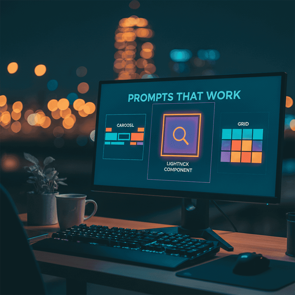
Hero Section Prompts That Stop the Scroll
The hero section is where most landing pages win or lose. You've got about 3 seconds to convince someone not to leave. No pressure.
Template 1: The SaaS Classic
Want to try this yourself?
Template 2: The Bold Statement
Template 3: The Social Proof Hero
Template 4: The Video Hero
Feature Section Prompts That Sell Benefits
Here's a hot take: most feature sections are boring lists that nobody reads. They list features when they should be selling outcomes. Your prompts should reflect that.
Template 5: The Bento Grid
Want to try this yourself?
Template 6: The Alternating Layout
Template 7: The Icon Grid
Template 8: The Comparison Feature
Pricing Table Prompts That Convert
Pricing pages are conversion battlegrounds. Get these wrong and you're leaving money on the table. Here's what works:
Template 9: The Three-Tier Classic
Template 10: The Comparison Table
| Feature | Starter | Pro | Enterprise |
|---|---|---|---|
| Projects | 3 | Unlimited | Unlimited |
| Team Members | 1 | 10 | Unlimited |
| Storage | 1GB | 50GB | 500GB |
| Support | Priority | Dedicated | |
| Price | Free | $29/mo | Custom |
Template 11: The Value-Focused Pricing
Testimonial Sections That Build Trust
Social proof isn't optional anymore. But there's a right way and a very wrong way to show testimonials.
Template 12: The Carousel Testimonial
Template 13: The Wall of Love
Template 14: The Case Study Card
CTA Sections That Drive Action
This is where you ask for the business. Mess it up and everything else was pointless.
Template 15: The Final Push
Want to try this yourself?
Template 16: The Email Capture CTA
Template 17: The Dual CTA
Full Landing Page Prompt Templates
Sometimes you want the whole thing in one shot. (Every full page stands on solid navigation and a footer — if those sections fight you, the AI navbar and footer prompts guide has dedicated templates.) Here are my go-to templates:
Template 18: The Complete SaaS Landing Page
Template 19: The Startup Launch Page
Mistakes That'll Ruin Your Results
I've made all of these. Learn from my pain:
- Forgetting mobile — Always add "Make fully responsive. Stack on mobile."
- Generic copy — "Welcome to our platform" says nothing. Be specific.
- CTA chaos — One page, one primary action. Period.
- No whitespace — Add "use generous spacing" or layouts feel cramped.
- Flat hierarchy — Tell AI what dominates: "Headline biggest, subtext smaller, CTA pops."
For deeper techniques on working with AI tools, check out our context engineering guide.
Quick Platform Tips
Different AI tools have different sweet spots. v0 loves Shadcn and Radix components—mention them explicitly. Lovable shines for multi-page flows. Fardino is optimized for React landing pages and dashboards with Tailwind. The universal rule? Specificity wins everywhere.
Ship It
AI landing page prompts are only as good as the context you feed them. Vague in, vague out. Specific in, shippable out.
Take these templates, tweak them for your brand, and build your own prompt library. Once you find what works, you'll reuse it forever.
Now stop reading and go build something.
Ready to try these prompts? Build with Fardino →
Got an idea? Build it now.
Describe the site or app you want — Fardino turns it into a live website.