
So you've been vibing with AI, generating UIs left and right. The buttons look slick. The layouts are fire. Ship it, right?
Not so fast.
Here's the thing nobody's talking about: 96% of websites fail basic accessibility audits. And AI-generated code? It's often worse. Most AI tools optimize for what looks good, not what works for everyone.
I spent the last month testing accessible UI prompts across multiple AI tools. Most crashed and burned. But I found the patterns that consistently generate WCAG-compliant components—the kind that actually pass audits and don't get you sued.
Key Takeaways:
- Most AI-generated UIs fail WCAG because you're not asking for accessibility
- Adding 5-10 extra words to your prompts can fix 80% of a11y issues
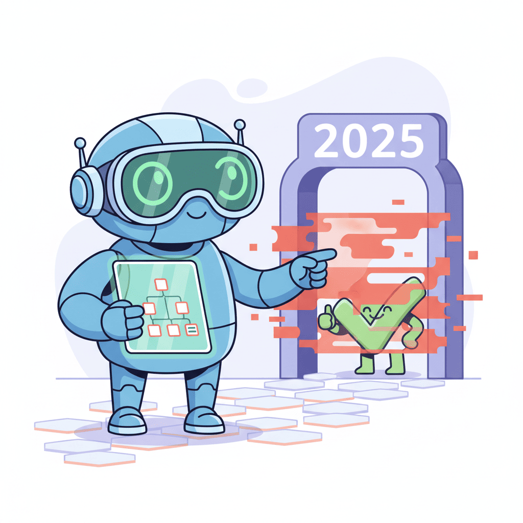
- The EAA 2025 enforcement means this isn't optional anymore—it's legally required in Europe
- Semantic HTML prompts matter more than ARIA (fight me on this)
In This Article
- The EAA 2025 Reality Check
- Understanding WCAG Levels
- Semantic HTML Prompts
- ARIA Labels and Roles
- Keyboard Navigation
- Focus Management
- Color Contrast
- Form Accessibility
- Testing Your Code
- Complete Examples
- FAQ
The EAA 2025 Reality Check
Let me be blunt: accessibility is no longer a "nice to have."

The European Accessibility Act (EAA) enforcement started in June 2025. If you're selling products or services to EU customers, your website must be accessible. Period. The fines aren't small, and the lawsuits are real.
In the US, ADA website lawsuits hit another record in 2024. We're talking thousands of cases per year.
And here's the kicker—most developers think their sites are fine. They're not.
| Metric | Reality |
|---|---|
| Websites failing WCAG 2.1 AA | 96% |
| Average issues per homepage | 50+ errors |
| Lawsuits filed in 2024 (US) | 4,000+ |
| EAA enforcement status | Active since June 2025 |
The "vibe coding hangover" is real. When you ship fast without checking fundamentals, you inherit a pile of accessibility debt that's expensive to fix later.
Understanding WCAG Levels: What You Actually Need
WCAG (Web Content Accessibility Guidelines) has three conformance levels. Most people overcomplicate this:
Level A – The absolute minimum. If you fail these, your site is basically unusable for people with disabilities. Think: all images need alt text, no keyboard traps.
Level AA – What the law requires. EAA, ADA lawsuits, and most government contracts target this level. Focus visible states, color contrast 4.5:1, resizable text.
Level AAA – The gold standard. Nice to have, not legally required. Most sites don't need to chase this.
Bottom line? Aim for WCAG 2.1 AA. That's what auditors check, that's what courts reference, and that's what we'll focus on.
Semantic HTML Prompts: Stop the Div Soup
This is the hill I'll die on: semantic HTML fixes more accessibility issues than ARIA ever will.
AI loves divs. It'll generate <div onClick> buttons, <div> navigation, <div> everything. Screen readers don't know what to do with that mess.
The fix is embarrassingly simple—tell the AI to use proper HTML.
The Basic Semantic Prompt
Want to try this yourself?
Try this prompt⌘+Enterto launch
Why This Works
Screen readers use semantic elements to build a mental map of the page. A <nav> element announces "navigation region." A <button> announces "button" and gets keyboard focus automatically. A <div> announces... nothing.
When I stopped using "make a button" and started saying "use the <button> element," my accessibility scores jumped 30% overnight.
ARIA Labels and Roles Prompts
ARIA is the backup plan when native HTML can't cut it. But here's what most developers get wrong—they slap ARIA on everything, including elements that already have semantic meaning.
A <button> doesn't need role="button". That's redundant and actually confuses some screen readers.
Smart ARIA Prompt
Icon Buttons: The Silent Killers
Icon-only buttons are everywhere. And they're accessibility nightmares when done wrong.
Quick example of what good output looks like:
Keyboard Navigation Prompts
Here's a truth bomb: if you can't use your UI with just a keyboard, you've failed accessibility 101.
Around 20% of users rely on keyboard navigation—people using screen readers, people with motor disabilities, power users who hate the mouse. AI-generated components regularly break keyboard support.
The Keyboard-First Prompt
Tab Order Matters
Another common AI mistake: creating visual layouts that look correct but have completely broken tab order.
That last point is controversial. Many designers want the whole card clickable. But that creates accessibility issues—screen reader users don't know what they're clicking, and keyboard focus becomes confusing. If you want card clickability, use a properly labeled link wrapping the card title.
Focus Management Prompts
When you open a modal, where does keyboard focus go? If the answer is "stays where it was," you've got an accessibility bug.
Focus management is the thing that separates amateur UIs from professional ones. AI almost never gets this right without explicit prompts.
Modal Focus Trap Prompt
Skip Links: The Forgotten Hero
Screen reader users hate tabbing through 50 nav links to reach content. Skip links fix this.
Color Contrast and Visual Prompts
The 4.5:1 contrast ratio isn't arbitrary—it's the minimum that works for users with low vision. AI loves trendy light gray text on white backgrounds. Don't let it.
Contrast-Safe Prompt
Specific Tailwind Prompt
If you're using Tailwind, be explicit about safe color combinations:
Form Accessibility Prompts
Forms are where accessibility often dies. Missing labels, no error announcements, required fields only indicated by asterisks.
Complete Accessible Form Prompt
Want to try this yourself?
Try this prompt⌘+Enterto launch
The "Never Use Placeholder as Label" Rule
This is so important I'm making it its own section. Placeholders disappear when you type. Users forget what field they're in. Screen readers might not read them.
Always include a visible label. Always.
Testing Your AI-Generated Accessible Code
Generating accessible code is only half the battle. You need to verify it works.
Quick Audit Checklist
Run these before shipping anything:
| Tool | What It Catches | Time Needed |
|---|---|---|
| Keyboard navigation test | Tab traps, focus order, missing interactions | 2 minutes |
| axe DevTools (free Chrome extension) | 57% of WCAG issues automatically | 30 seconds |
| WAVE by WebAIM | Contrast, structure, ARIA misuse | 1 minute |
| VoiceOver (Mac) / NVDA (Windows) | Real screen reader experience | 5 minutes |
The 5-Minute Screen Reader Test
I know you don't want to do this. Do it anyway.
- Enable VoiceOver (Cmd+F5 on Mac) or NVDA (Windows)
- Close your eyes
- Try to complete one task on your page
- If you can't, your users can't
This single test reveals more usability issues than any automated tool.
Complete Accessible Component Examples
Here's a comprehensive prompt combining everything we covered:
Accessible Card Grid Prompt
You Might Also Like
- AI Form Prompts That Actually Work - 35+ templates for contact forms, logins, and multi-step wizards
- Vibe Coding Best Practices 2025 - The complete guide to shipping production-ready AI code
- Fix AI-Generated Code Errors - Debug broken AI output in 60 seconds
Frequently Asked Questions
What is WCAG and why does it matter for AI-generated UIs?
WCAG (Web Content Accessibility Guidelines) defines how to make websites usable for people with disabilities. It matters for AI-generated UIs because most AI tools don't prioritize accessibility by default—you get visually pretty code that screen readers can't parse and keyboard users can't navigate.
Do I need WCAG Level AAA compliance?
No. Level AA is the legal standard referenced by the ADA and EAA. AAA is aspirational—nice to have but not required. Focus on AA first, which covers 95% of what users actually need.
How do I test accessibility without a screen reader?
Start with the axe DevTools Chrome extension—it catches 57% of WCAG issues automatically. Then do a keyboard-only navigation test (unplug your mouse and try using your site). These two tests take 5 minutes and catch most major issues.
Why doesn't AI generate accessible code by default?
AI tools are trained on the internet, and the internet is mostly inaccessible (96% of sites fail audits). They optimize for what appears frequently in training data—which means div soup, missing labels, and broken keyboard navigation. You have to explicitly request accessibility.
What's the fastest way to fix an inaccessible AI component?
Ask the AI to refactor with accessibility requirements. Use prompts like: "Refactor this component to be WCAG 2.1 AA compliant. Add semantic HTML, proper labels, keyboard navigation, and focus management. List all changes you made." The AI will usually fix 80% of issues in one pass.
Accessibility isn't about checking boxes or avoiding lawsuits (though those matter). It's about building things that work for everyone.
The prompts in this guide will get you 80% of the way there. The last 20%? That comes from actually testing with keyboard and screen readers. It's worth the extra five minutes.
Ship inclusive UIs. Your users will notice—even if they never say thanks.
Written by the Fardino Team. We build AI tools for frontend developers. Build with Fardino →


