Here's a stat that should terrify you: 40-60% of users who sign up for your product never come back after their first session. Not because your app sucks. Because your onboarding does.
I've built 15 onboarding flows with AI in the past month. Most generated clunky, form-heavy screens that felt like filling out a DMV application. But some prompts? They produced flows that actually felt like a product tour from a $10M startup.
Key Takeaways:
- Good AI onboarding flow prompts require explicit structure—step count, progress indicators, and clear CTAs
- The best flows feel conversational, not like paperwork—personalization beats data collection
- Most prompts fail because they skip empty states and first-use experiences
In This Article
- Why Onboarding UX Makes or Breaks Products
- Anatomy of a Great Onboarding Flow
- Welcome Screen Prompts That Hook
- Step Wizard Prompts (3-5 Steps)
- Progress Indicators and Steppers
- Role Selection and Personalization
- Empty State and First-Use Prompts
- Checklist and Task Completion UI
- Tooltip and Guided Tour Prompts
- Common Mistakes (And Fixes)
- Complete Onboarding Template
- FAQ
Why Onboarding UX Makes or Breaks Products
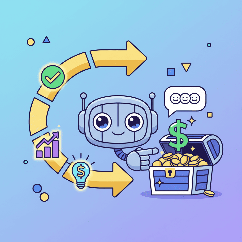
Let's be blunt: your onboarding flow is the single biggest lever you have for retention. Research shows good onboarding can boost retention by up to 50%. That's not a typo.

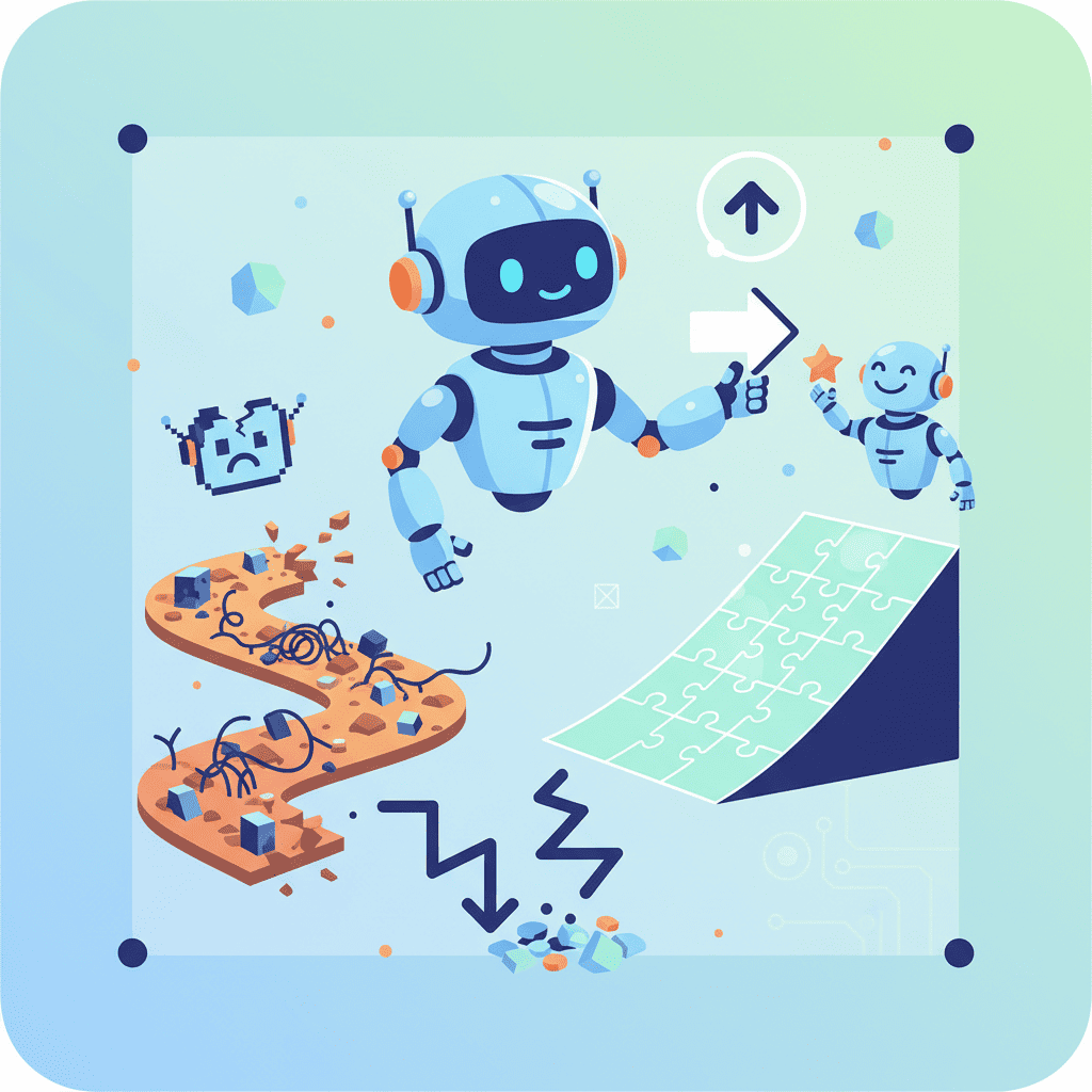
The problem? Most developers treat onboarding as an afterthought. "Users will figure it out." Spoiler: they won't. They'll bounce to a competitor who actually guides them to their first win.
This is where AI onboarding flow prompts change the game. You can prototype and test different flows in minutes instead of days. But only if you know what to ask for.
Anatomy of a Great Onboarding Flow
Before we dive into prompts, let's establish what makes onboarding actually work. This is the hill I'll die on: great onboarding has exactly five components.
| Component | Purpose | AI Prompt Focus |
|---|---|---|
| Welcome screen | Build excitement, set expectations | Headline, value prop, single CTA |
| Progressive steps | Collect info without overwhelming | Step indicators, minimal fields per step |
| Personalization | Make users feel seen | Role/goal selection that affects their experience |
| First win moment | Deliver value fast | Empty states that guide to action |
| Reinforcement | Encourage continued engagement | Checklists, progress tracking |
Miss any of these, and you're leaving retention on the table.
Welcome Screen Prompts That Hook
The welcome screen is your one shot to make users feel like they made the right choice. Most AI prompts generate boring, corporate-feeling welcomes. Here's how to fix that.

The Basic Welcome (That Actually Works)
Create a welcome modal for first-time users of a [type] app. Include: - Friendly headline with the product name - 1-sentence value proposition - Illustration placeholder (300x200px) - Primary "Get Started" button - Small "Skip for now" text link - "Don't show again" checkbox at bottom Use warm, conversational copy. The tone should feel like a helpful friend, not a sales pitch.
Want to try this yourself?
The Personality-Driven Welcome
When you want to stand out:
Build a welcome screen for a [type of app]. This isn't corporate software—it's a tool people will love using. Include: - Playful headline using an emoji - Animated gradient background (subtle, not distracting) - 3 quick benefit bullets with icons - Large friendly avatar/mascot placeholder - Bouncy CTA button with hover effect - Progress dots showing this is step 1 of 4 Make it feel like opening a gift, not logging into a bank.
The key insight? Telling the AI about the feeling you want produces better results than just describing UI elements. This is something that trips up a lot of developers when getting started with vibe coding.
Step Wizard Prompts (3-5 Steps)
Multi-step onboarding is where most AI prompts completely fall apart. You ask for "a 4-step wizard" and get either a giant form split randomly, or four disconnected screens with no cohesion.
Here's my battle-tested approach:
The Foolproof Step Wizard Prompt
Create a 4-step onboarding wizard for a SaaS productivity app. Structure: STEP 1: WELCOME - Headline: "Let's set up your workspace" - Single input: workspace name - Show progress bar (25% filled) STEP 2: ROLE SELECTION - Question: "What best describes you?" - 4 card options with icons: Founder, Developer, Designer, Manager - Single selection, cards highlight on select STEP 3: TEAM SIZE - Question: "How big is your team?" - Horizontal button group: Just me, 2-5, 6-20, 20+ - Brief explanation of how this affects their setup STEP 4: COMPLETION - Celebration animation/confetti - "You're all set!" message - Primary button: "Go to dashboard" - Secondary: "Take a quick tour" Include Back/Next navigation throughout. Next button disabled until current step is valid.
Notice how explicit this is? That's intentional. AI tools excel when you give them clear structure, not vague descriptions.
The Progressive Disclosure Wizard
For apps that need more info without overwhelming:
Build a 5-step onboarding wizard with progressive disclosure pattern: Each step should: - Have a single clear objective - Show numbered progress (Step 2 of 5) - Include one optional "Advanced options" expandable section - Have consistent Next/Back buttons positioned at bottom right - Animate transitions between steps (slide left/right) Steps: 1. Basic info (name, email if not SSO) 2. Primary use case selection (grid of 6 options with icons) 3. Customize preferences (3 toggles maximum) 4. Connect integrations (optional, with "Skip for now") 5. Success state with personalized next steps Add keyboard navigation: Enter to proceed, Escape to go back.
Want to try this yourself?
Progress Indicators and Steppers
Progress indicators seem simple, but they're psychologically powerful. They give users confidence they won't be stuck forever filling out forms.
Create a horizontal stepper component for a 5-step process. Requirements: - Each step shows: number, title, and status icon - States: completed (checkmark, green), active (filled circle, blue), upcoming (empty circle, gray) - Clicking completed steps should navigate back - On mobile: collapse to "Step 3 of 5" with a progress bar - Smooth animation when transitioning between steps Steps: Account → Profile → Preferences → Team → Complete
The Vertical Timeline Stepper
For more complex onboarding (like multi-step forms):
Build a vertical stepper/timeline for onboarding. Layout: - Left side: vertical timeline with step circles connected by lines - Right side: current step content - Completed steps show summary text instead of form On mobile, hide timeline and show progress as a top bar with percentage.
Role Selection and Personalization
Here's what nobody tells you: personalization isn't about collecting data. It's about making users feel understood. The questions you ask should obviously connect to what they'll experience next.
The Role Selection Grid
Create a role selection screen for onboarding. Requirements: - Headline: "What brings you to [Product]?" - Grid of 4-6 role cards (2 columns on desktop, 1 on mobile) - Each card has: icon, title, brief description (max 10 words) - Cards have hover effect and selected state with checkmark - Single selection only - Show "This helps us personalize your experience" helper text - Continue button at bottom, disabled until selection made Roles for a project management app: 1. Product Manager - Planning sprints and roadmaps 2. Developer - Tracking tasks and code reviews 3. Designer - Managing design projects 4. Founder - Overview of everything at once 5. Marketing - Campaign tracking and launches 6. Other - Just exploring for now
Goal-Based Personalization
Build a goal selection step for SaaS onboarding. Multi-select allowed. Layout: - Headline: "What do you want to achieve?" - Subtext: "Select all that apply" - 6 option pills/chips in a flex wrap layout - Selected chips have filled background, unselected are outlined - Minimum 1 selection required - "Continue" button with count: "Continue with 3 goals" Make the selection feel satisfying—add subtle animation on toggle.
Empty State and First-Use Prompts
This is the most overlooked part of onboarding. Users finish your wizard, land on the dashboard, and... it's empty. They have no idea what to do next.
Empty states should guide, not just inform.
The Actionable Empty State
Create an empty state component for a [dashboard/project list/inbox]. Layout: - Centered container (max-width 400px) - Illustration placeholder (200x150px, dashed border) - Headline: descriptive but friendly - Body text: 2 sentences max explaining the value - Primary CTA button - Optional secondary link: "Learn more" or "Watch demo" Example for empty projects list: - Headline: "Start your first project" - Body: "Projects help you organize tasks and collaborate with your team. Create one now to get started." - CTA: "Create Project" Make it feel inviting, not like an error state.
First-Use Callouts
Build a first-use experience for a dashboard with guided callouts: When user lands on dashboard for first time: 1. Show a pulsing dot on the "New Project" button 2. Display a tooltip/popover: "Click here to create your first project" 3. Dim the rest of the interface slightly (not modal, just de-emphasized) 4. Include "Dismiss" and "Show me around" options After dismissing, the highlight should not reappear. Store state with a "hasSeenOnboarding" pattern.
Checklist and Task Completion UI
Checklists are addictive. There's something deeply satisfying about checking items off a list. Use that psychology for onboarding retention.
The Sticky Onboarding Checklist
Build a user onboarding checklist component with 5 tasks. Requirements: - Card-style container with shadow - Header: "Getting Started" with completion percentage - Progress bar showing overall completion - 5 task items, each with: - Checkbox (or circular progress indicator) - Task title - Estimated time (e.g., "2 min") - Brief description (1 line) - Completed tasks get strikethrough and checkmark - Clicking a task item should navigate to that feature - Collapse/expand functionality for sidebar placement - "Dismiss forever" option in header menu Tasks for a CRM app: 1. Add your first contact (1 min) 2. Import contacts from CSV (3 min) 3. Set up email integration (2 min) 4. Create a sales pipeline (2 min) 5. Invite a team member (1 min)
Want to try this yourself?
The Gamified Progress Tracker
For products where engagement is key:
Create a gamified onboarding progress tracker: - Circular progress ring in sidebar/header (60px) - Percentage in center - Expand on click to show task list - Completed tasks award XP points - Show level/badge: "Getting Started", "Power User", "Pro" - Add subtle celebration animation at 25%, 50%, 75%, 100% - Include streak counter: "3-day streak 🔥" Make it feel rewarding, not patronizing.
Tooltip and Guided Tour Prompts
Product tours can feel annoying—or incredibly helpful. The difference is timing and relevance.
The Contextual Tooltip System
Create a product tour tooltip system. Components needed: TOOLTIP COMPONENT: - Arrow pointing to target element - Title (bold), description, optional image - Step counter: "2 of 5" - Previous/Next/Skip buttons - Keyboard accessible (arrow keys navigate) HIGHLIGHT OVERLAY: - Dark overlay around entire page - Spotlight/cutout around highlighted element - Smooth transition between highlighted elements TOUR CONTROLLER: - Start tour button - Progress saved if user leaves mid-tour - "Don't show this again" option The tooltip should position intelligently (flip if near screen edge).
The Inline Hint System
For ongoing guidance instead of one-time tours:
Build an inline hint system for a complex UI: - Small "?" icon next to feature labels - On hover/click: show mini-tooltip with explanation - First-time users see hints automatically expanded - "Pro tip" callouts in yellow/orange for power features - Tips can be dismissed individually - Master toggle: "Hide all hints" Keep explanations under 20 words. Link to docs for details.
This pairs well with micro-interactions and animations for a polished feel.
Common Mistakes (And Fixes)
Let's talk about what goes wrong. I've seen these same mistakes dozens of times.
| Mistake | Why It Happens | The Fix |
|---|---|---|
| Too many steps | Collecting every possible data point | Only ask what affects initial experience |
| No progress indicator | Assuming users trust you | Always show where they are and how long it takes |
| Generic welcome | Rushing through mockups | Tell AI the specific emotion you want to evoke |
| Empty dashboard after onboarding | Treating onboarding as isolated | Plan the "first 5 minutes after signup" holistically |
| Skipping mobile | Testing only on desktop | Always specify mobile behavior in prompts |
| No escape hatch | Forcing completion | Include skip options for optional steps |
And honestly? The biggest mistake is overthinking it. Start simple. A 3-step wizard beats a 10-step monster that nobody completes.
Complete Onboarding Template
Here's a full-featured prompt you can customize:
Create a complete onboarding flow for a [type] SaaS app. Include: WELCOME MODAL (Page 1): - Product logo and name - Welcoming headline with user's name if available - Brief value proposition (1 sentence) - Avatar/illustration placeholder - "Let's get started" primary button - Subtle background pattern or gradient STEP WIZARD (Pages 2-5): - Horizontal progress bar at top - Step 2: Role selection (4 card options) - Step 3: Primary goal multi-select (6 options as pills) - Step 4: Team invitation (email input, skip option) - Consistent card layout, centered, max-width 600px - Back button (except step 1), Next/Continue button - Transition animations between steps COMPLETION PAGE (Page 6): - Celebratory animation (confetti or similar) - "You're all set, [Name]!" heading - Quick summary of their selections - "Go to Dashboard" primary button - "Take a 2-minute tour" secondary option DASHBOARD FIRST-VIEW: - Onboarding checklist widget (5 tasks, collapsible) - Welcome banner that can be dismissed - First empty state with clear CTA Use Tailwind CSS, React components, proper TypeScript types. Mobile responsive at all breakpoints.
For related patterns, check out our SaaS dashboard and modal and overlay prompts guides.
You Might Also Like
- AI Form Prompts: 35+ Templates for React Forms - Multi-step forms share patterns with onboarding wizards
- Build a SaaS Dashboard with AI - Where your users land after onboarding
- AI Modal Prompts: 30+ Templates That Convert - Welcome screens and popups that work
Frequently Asked Questions
How many steps should an onboarding flow have?
Aim for 3-5 steps maximum. Research shows completion rates drop dramatically after 5 steps. Every step you add should demonstrably improve the user's first experience—if it doesn't, cut it.
What's the difference between onboarding and a product tour?
Onboarding typically happens once, collects initial preferences, and guides users to their first success moment. Product tours explain features and can be re-triggered. Many apps combine both—an initial wizard followed by contextual tooltips.
Should I require users to complete onboarding?
Generally, no. Always provide skip options for non-essential steps. Forcing users through lengthy onboarding increases abandonment. Make the benefits of completing each step clear instead of mandating it.
How do I test if my onboarding is working?
Track completion rates per step, time to first value action (like creating their first project), and 7-day retention comparing users who completed onboarding vs. those who skipped. A/B test different flows to find what works for your audience.
Can I build personalized onboarding based on signup source?
Absolutely. If someone comes from a specific campaign or referral, customize the welcome message and suggested actions. You can pass context through URL parameters and conditionally render different flows.
Written by the 0xMinds Team. We build AI tools for frontend developers. Try 0xMinds free →
<!-- SCHEMA_DATA { "article": { "@type": "Article", "headline": "AI Onboarding Flow Prompts That Convert", "description": "I built 15 onboarding flows with AI. Most felt clunky. Here are the exact prompts that create smooth, retention-boosting user journeys.", "author": { "@type": "Organization", "name": "0xMinds", "url": "https://0xminds.com" }, "datePublished": "2025-12-20", "dateModified": "2025-12-20" }, "faq": [ { "question": "How many steps should an onboarding flow have?", "answer": "Aim for 3-5 steps maximum. Research shows completion rates drop dramatically after 5 steps. Every step you add should demonstrably improve the user's first experience." }, { "question": "What's the difference between onboarding and a product tour?", "answer": "Onboarding typically happens once, collects initial preferences, and guides users to their first success moment. Product tours explain features and can be re-triggered." }, { "question": "Should I require users to complete onboarding?", "answer": "Generally, no. Always provide skip options for non-essential steps. Forcing users through lengthy onboarding increases abandonment." }, { "question": "How do I test if my onboarding is working?", "answer": "Track completion rates per step, time to first value action, and 7-day retention comparing users who completed onboarding vs. those who skipped. A/B test different flows." }, { "question": "Can I build personalized onboarding based on signup source?", "answer": "Absolutely. If someone comes from a specific campaign or referral, customize the welcome message and suggested actions through URL parameters." } ], "howto": { "name": "How to Build Onboarding Flows with AI Prompts", "steps": [ {"name": "Write your welcome screen prompt", "text": "Start with a welcome modal that includes a friendly headline, value proposition, and clear CTA. Tell the AI what emotional tone you want."}, {"name": "Structure your step wizard", "text": "Create 3-5 explicit steps with clear objectives per step. Include progress indicators and Back/Next navigation."}, {"name": "Add personalization options", "text": "Include role selection or goal-setting steps that obviously connect to customizing their experience."}, {"name": "Design empty states", "text": "Plan what users see after completing onboarding. Empty dashboards kill retention—add actionable guidance."}, {"name": "Include reinforcement", "text": "Add a checklist or progress tracker to encourage completing remaining setup tasks over the first few days."} ] }, "breadcrumb": ["Home", "Blog", "Guides", "AI Onboarding Flow Prompts That Convert"] } SCHEMA_DATA -->