
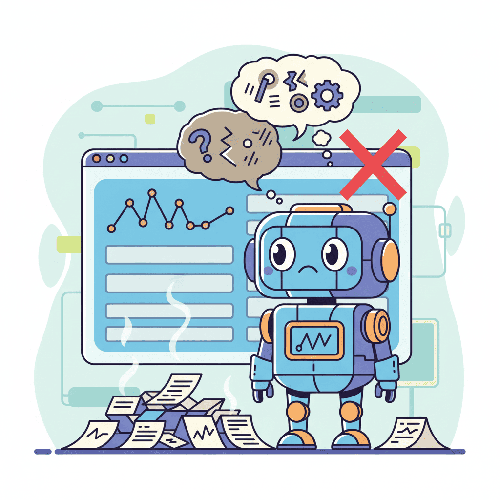
So you want to build a SaaS dashboard with AI. You've probably tried a few prompts already—maybe something like "create a dashboard for my SaaS app"—and gotten back something that looks like it was designed by a spreadsheet from 2008.
I get it. I've been there. Last month alone, I built 12 different SaaS dashboards using AI, and let me tell you: most of my early attempts were garbage. But somewhere around dashboard number 7, something clicked.
The problem isn't the AI. It's how we're asking.
Key Takeaways:
- Generic dashboard prompts fail. You need to specify metrics, layout, and component hierarchy.
- Build dashboards in layers: structure first, then individual components, then styling.
- Dark mode and responsive design aren't "nice to have"—include them from the start or you'll regret it.
In This Article
- Why Most Dashboard Prompts Fail
- The Dashboard Component Hierarchy
- Layout and Structure Prompts
- Metrics Cards That Actually Look Good
- Data Tables and Filters
- Charts and Visualizations
- Dark Mode From Day One
- The Full Dashboard Prompt
- FAQ
Why Most Dashboard Prompts Fail
Here's the thing nobody tells you about AI-generated dashboards: vague prompts produce vague results.

When you type "create a SaaS dashboard," the AI has no idea what kind of SaaS, what metrics matter, who's looking at it, or what actions they need to take. It's like asking a chef to "make food"—technically they can do it, but you might end up with toast when you wanted a steak.
The prompts that work share three characteristics:
- Specific metrics — Not "show some stats," but "show MRR, churn rate, active users, and trial conversions"
- Clear hierarchy — What's the most important thing? What's secondary?
- Context about the user — Is this for a CEO or a support agent? That changes everything.
If you're new to this whole AI UI generation thing, check out our vibe coding for beginners guide first. But if you've got the basics down, let's build something real.
The Dashboard Component Hierarchy
Before we touch any prompts, let's talk structure. Every solid SaaS dashboard has these pieces:
| Component | Purpose | Priority |
|---|---|---|
| Sidebar Navigation | App navigation, user context | Required |
| Header Bar | Search, notifications, profile | Required |
| Metrics Cards | KPIs at a glance | High |
| Data Tables | Detailed records | High |
| Charts | Trends and patterns | Medium |
| Activity Feed | Recent events | Low |
Here's my hot take: start with the sidebar and header, not the metrics. I know everyone wants to jump straight to the sexy chart components, but your dashboard will feel disjointed if the navigation is an afterthought.
Layout and Structure Prompts
Alright, let's get practical. Here's the prompt I use to establish the foundation:
Want to try this yourself?
Try this prompt⌘+Enterto launch
This gives you a solid shell. The key details that make this work:
- Specific width (240px) instead of "narrow sidebar"
- Exact navigation items so it's not generic
- "Collapsed state" forces the AI to think about responsiveness
Metrics Cards That Actually Look Good
Now for the fun part. Metrics cards are where most AI dashboards look either amazing or amateurish. The difference? Specificity in your prompt.
Bad prompt: "Add some metric cards"
Good prompt:
See the difference? You're not asking the AI to guess what metrics matter—you're telling it exactly what to show and how to style the changes.
Pro tip: Always specify whether "down" is good or bad. For churn rate, down is good (green). For revenue, down is bad (red). AI gets confused about this constantly.
Data Tables and Filters
If your dashboard doesn't have a data table, is it even a SaaS dashboard? Trick question—it's not.
Here's a prompt that generates tables people actually want to use:
This is dense, but that's the point. The more specific you are about filtering, sorting, and actions, the less cleanup you'll do later.
For more on this approach—building components piece by piece instead of all at once—our context engineering guide breaks down the methodology in detail.
Charts and Visualizations
Charts are where things get tricky. Most AI tools struggle with data visualization because charts need actual data structures, not just visual descriptions.
Here's what works:
The secret? Include sample data. When you give the AI actual numbers, it can generate working charts with realistic proportions. Without sample data, you get placeholder charts that look wrong.
One thing I learned the hard way: specify the charting library. I mention Recharts because it plays nice with React and Tailwind. If you don't specify, some AI tools will generate Chart.js, others will use D3, and some will try to build charts from scratch (don't let them).
Dark Mode From Day One
Look, I'm going to be direct about this: if you're building a dashboard in 2025 without dark mode support, you're doing it wrong.
And here's the thing—retrofitting dark mode is a nightmare. Adding it from the start is almost free. Here's how to include it:
The localStorage detail is important. Nobody wants to toggle dark mode every time they refresh the page.
The Full Dashboard Prompt
Okay, you've seen the individual pieces. Here's a comprehensive prompt that brings it all together—the one I use when I need a complete dashboard fast:
Want to try this yourself?
Try this prompt⌘+Enterto launch
Yes, it's long. That's the point. Comprehensive prompts produce comprehensive results.
Pro Tips for Better AI Dashboards
After building way too many of these, here's what I wish I'd known earlier:
1. Build in layers, not all at once
Generate the layout first, nail it, then add metrics, then tables, then charts. Trying to get everything perfect in one prompt is a recipe for frustration.
2. Name your sample data realistically
"John Doe" and "Jane Smith" are fine, but "Acme Corp" and "TechStart Inc" make your demo look more professional. Small detail, big impact.
3. Always specify responsive breakpoints
If you don't mention tablet and mobile, you won't get them. Add "responsive: desktop (4 cols), tablet (2 cols), mobile (1 col)" to any grid prompt.
4. Include loading and empty states
Add this to any component prompt: "Include skeleton loading state and empty state with illustration." Future you will thank present you.
5. Don't forget hover and focus states
"Hover state on table rows, focus ring on interactive elements" takes 10 words but saves 10 minutes of CSS tweaking.
For more advanced techniques on getting better results from AI tools, our vibe coding best practices guide goes deep on the methodology.
Wrapping Up
Building a SaaS dashboard with AI isn't about finding the perfect magic prompt. It's about understanding what makes dashboards work and communicating that clearly to the AI.
The prompts I shared took me weeks of trial and error to develop. You can use them as-is, or better yet, use them as templates and customize for your specific SaaS metrics. A dashboard for a subscription box company looks different from one for a developer tool.
Start with the layout shell. Get that right. Then layer in your metrics, tables, and charts. Include dark mode from the beginning. Be specific about your data and styling.
That's it. That's the whole secret. Now go build something.
You Might Also Like
- AI Dashboard Prompts: 40+ Templates for Admin Panels — More focused prompt templates for specific dashboard components
- AI Landing Page Prompts: 50+ Templates That Actually Work — Similar approach applied to landing page generation
- Context Engineering for AI Coding — The deeper methodology behind effective AI prompting
Frequently Asked Questions
How do I build a SaaS dashboard with AI?
Start with a detailed prompt that specifies your layout structure, metrics, and styling preferences. Build in layers—layout first, then metrics cards, then data tables, then charts. Include specific sample data and always specify the tech stack (React, Tailwind, chart library) for best results.
What prompts work best for AI dashboards?
The best dashboard prompts include specific metrics with actual values, clear component hierarchy, responsive breakpoints, and styling details like colors and shadows. Generic prompts like "create a dashboard" fail because the AI can't infer your business context.
Can AI generate responsive dashboards?
Yes, but you need to explicitly request it. Include breakpoints in your prompt: "4 columns on desktop, 2 on tablet, 1 on mobile." Without this, most AI tools generate desktop-only layouts that look broken on phones.
How do I add charts to AI-generated dashboards?
Specify your charting library (Recharts, Chart.js) and include sample data with actual numbers. Describe the chart type, data structure, colors, and hover interactions. Without sample data, you'll get placeholder charts with unrealistic proportions.
Should I use dark mode in my dashboard?
Absolutely—82% of developers prefer dark mode for tools they use daily. More importantly, add it from the start. Retrofitting dark mode requires touching every component, while including it initially is nearly free with Tailwind's dark: variants.
Written by the Fardino Team. We build AI tools for frontend developers. Build with Fardino →


