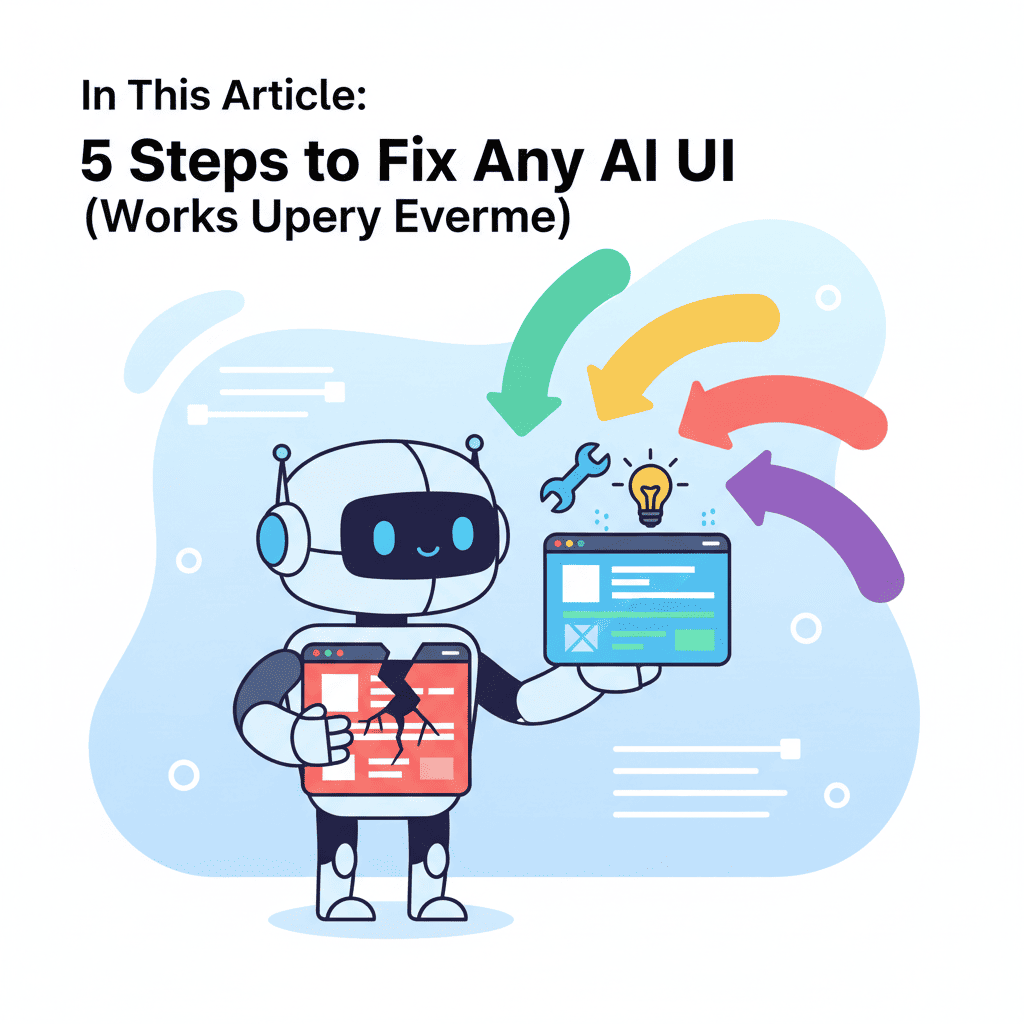
5 Steps to Fix Any AI UI (Works Every Time)
Your first AI output is garbage. And that's fine. Look, I'm going to be honest with you: if you're expecting perfect UI on the first try, you're doing vibe coding wrong. I've generated hundreds of components over the past year,

Your first AI output is garbage. And that's fine.
Look, I'm going to be honest with you: if you're expecting perfect UI on the first try, you're doing vibe coding wrong. I've generated hundreds of components over the past year, and here's what I've learned—the magic isn't in the initial prompt. It's in knowing how to make AI generate better UI through iteration.
Every AI tutorial out there shows you the prompt. Screenshot of the beautiful result. "Look how easy!" they say. What they don't show is the 4 rounds of back-and-forth that actually got them there. The part where the hero section looked like a 2008 MySpace page. The part where the button was somehow both too big AND too small.
That ends today. Here's my 5-step iteration workflow that fixes any AI UI.
Key Takeaways:
- Your first AI output is a starting point, not the finish line—expect 3-5 iterations
- Most UI issues fall into 5 predictable categories (and each has a fix)
- The "Feedback Prompt Formula" cuts your iteration time in half
- Screenshot-based feedback beats text descriptions every time
- Knowing when to regenerate vs. when to iterate saves hours of frustration
In This Article
- Why Your First Output Is Never Final
- Step 1: Identify What's Actually Wrong
- Step 2: The Feedback Prompt Formula
- Step 3: Screenshot-Based Iteration
- Step 4: Component-Level vs Full Regeneration
- Step 5: Know When to Start Fresh
- Real Example: 4 Iterations
- FAQ
Step 0: Accept That Your First Output Is Never Final
Before we dive into the how, let's kill a myth: good vibe coders don't write better initial prompts. They iterate better.
I tracked my last 50 UI generations. Want to know my "first-try success" rate? 12%. That's not because I write bad prompts—I've been doing this for a while. It's because AI tools are genuinely terrible at reading your mind.
Think about it. When you write "create a modern hero section for a SaaS product," you have a mental image. The AI has... training data. Those are very different things.
The gap between expectation and output isn't a bug. It's the starting point.
Step 1: Identify What's Actually Wrong
Here's where most people mess up: they see something wrong and immediately start typing a new prompt. "Make it better." "Make it more modern." "Fix the spacing."
That's vague. And vague prompts get vague fixes.
Before you type anything, categorize the problem. In my experience, 90% of AI UI issues fall into exactly 5 buckets:
| Issue Category | Signs You'll Notice | Quick Diagnosis |
|---|---|---|
| Spacing & Layout | Things feel cramped or floating in space | Squint at it—does the whitespace look intentional? |
| Visual Hierarchy | Can't tell what's most important | Where does your eye go first? Is that right? |
| Color & Contrast | Eye strain, or everything looks the same | Screenshot it in grayscale. Still readable? |
| Component Sizing | Elements feel too big/small for context | Compare to known working UIs |
| Responsiveness | Breaks at different screen sizes | Actually resize your browser |
Here's my hot take: spacing issues are responsible for 60% of "this doesn't look right" feelings. Most of the time, when something feels off but you can't articulate why, it's padding and margin problems.
Once you've diagnosed the category, you can write a targeted fix prompt instead of throwing spaghetti at the wall.
Step 2: The Feedback Prompt Formula
Alright, you know what's wrong. Now you need to tell the AI how to fix it without it making everything else worse. This is where the Feedback Prompt Formula comes in.

Here's the structure I use every single time:
Let me show you what this looks like in practice:
Bad iteration prompt:
Make the hero section better. The spacing is weird.
Good iteration prompt (using the formula):
KEEP: The gradient background and the CTA button styling FIX: The spacing between the headline and subheadline feels too tight—they're almost touching REFERENCE: Add about 24px gap, similar to Stripe's hero section
See the difference? The second prompt tells the AI exactly what to preserve, what to change, and gives it a concrete reference point.
Why this works: AI tools are good at following specific instructions. They're terrible at interpreting "make it better." When you anchor your feedback to specific elements and measurements, you get predictable results.
One more tip: if you've got multiple issues, fix them in separate iterations. I know it feels inefficient, but cramming 5 fixes into one prompt usually means the AI prioritizes weirdly and you end up playing whack-a-mole.
Step 3: Screenshot-Based Iteration (The Game Changer)
This is the step that changed everything for me. And honestly? Almost nobody talks about it.
Most AI UI tools now accept images as input. Use. This. Feature.
Instead of trying to describe what's wrong with words, show the AI. But here's the key—annotate your screenshots. Mark up the problem areas.
Here's my workflow:
- Screenshot the current output
- Open it in any basic image editor (Preview on Mac, Paint, whatever)
- Draw arrows or circles around problem areas
- Add text labels like "too cramped" or "wrong color"
- Feed the annotated image back with a simple prompt: "Fix the issues I marked"
This works because you're communicating in the AI's native language—visual information. Trying to describe "the third button in the second row is slightly misaligned" in text is painful. Drawing an arrow? Takes 2 seconds.
Pro tip for visual debugging: When checking color contrast issues, take a screenshot and apply a grayscale filter. If you can't distinguish between elements in grayscale, your accessibility contrast is probably broken too. Kill two birds with one stone.
If you're building something more complex, check out our guide on fixing AI-generated code errors—it covers the code-side debugging that complements this visual workflow.
Step 4: Component-Level Fixes vs Full Regeneration
Here's a decision tree I wish someone had given me when I started:
Regenerate the whole thing when:
- The overall layout approach is wrong (you asked for a grid, got a single column)
- More than 3 major elements need fixing
- The AI interpreted your concept completely differently than intended
- You're on iteration 5+ and it's still not working
Iterate on components when:
- 1-2 specific elements are off
- The structure is right, just the details are wrong
- You like 70%+ of the output
- The fixes are in the same category (all spacing issues, all color issues)
Here's the thing: sunk cost fallacy is REAL in vibe coding. You've been iterating for 20 minutes. You've refined the header perfectly. But the entire layout is fundamentally broken for your use case.
Let it go. Start fresh.
I've wasted hours trying to "save" iterations that should have been abandoned at minute 5. Now I have a rule: if the third iteration doesn't show meaningful progress, I regenerate from scratch with a completely reworded prompt.
The vibe coding mistakes guide goes deeper on this—specifically mistake #4 about over-attachment to generated code.
Step 5: Know When to Start Fresh
Sometimes the best iteration is no iteration at all. Just a fresh start.
But here's the nuance: don't just run the same prompt again. If it didn't work the first time, it probably won't work the fifth time. The AI isn't rolling dice—it's pattern matching from your input.
When starting fresh, change your approach:
| If This Failed... | Try This Instead |
|---|---|
| Long, detailed prompt | Shorter, focused prompt |
| Abstract description ("modern, clean") | Concrete reference ("like Linear's dashboard") |
| Starting with the whole page | Starting with one component, then building out |
| Describing visual style | Describing user behavior ("user should immediately see the CTA") |
Here's something that took me way too long to figure out: the best "fresh start" prompt often describes the problem you're solving rather than the UI you want.
Before: "Create a pricing table with 3 tiers, the middle one highlighted"
After: "Users need to compare pricing and choose a plan. Most should pick the Pro tier, but some enterprise users need the custom option."
The second prompt gives the AI context about intent. It might make different design choices, but they'll be choices that serve the actual goal.
For more on writing prompts that work the first time, the vibe coding best practices guide has a whole section on this.
From Broken to Beautiful: A Real Example
Let me walk you through an actual iteration sequence I did last week. I needed a feature comparison section for a SaaS landing page.
Iteration 1 - The prompt:
Create a feature comparison section showing Basic, Pro, and Enterprise plans with checkmarks for included features
What I got: A basic table. Functional, but looked like an Excel spreadsheet from 2005. No visual hierarchy, no highlighting of the recommended plan.
Iteration 2 - Using the feedback formula:
KEEP: The three-column structure and feature list FIX: The middle column should stand out as the recommended option REFERENCE: Add a "Most Popular" badge, slight scale increase, and different background color
What I got: Better! The middle plan popped. But now the typography was inconsistent—the Pro plan had larger text that made everything feel unbalanced.
Iteration 3 - Screenshot-based fix: Uploaded a screenshot with arrows pointing to the text size inconsistency. Prompt: "Fix the marked issues—keep text sizes consistent across all columns"
What I got: Typography fixed. But I noticed the mobile view was completely broken. Three columns squeezed into a phone screen.
Iteration 4 - Final polish:
KEEP: Desktop layout exactly as is FIX: Mobile view needs to stack columns vertically with horizontal swipe or accordion REFERENCE: Similar to how Tailwind UI handles responsive pricing tables
Final result: Clean, responsive, and actually looked professional. Four iterations, about 8 minutes total.
The finished component looked nothing like iteration 1. And that's the point.
If you want to practice this workflow, the vibe coding beginners tutorial walks through building a complete project with iteration checkpoints.
The 80/20 Rule of AI Iteration
Here's what separates good vibe coders from frustrated ones: knowing that 80% of your improvement comes from 20% of your iterations.
That first iteration after your initial output? Probably your biggest improvement. The fifth iteration fixing a 2px misalignment? Diminishing returns.
Set a time box. I give myself 10 minutes per component. If it's not 90% right by then, I either regenerate or move on and circle back later. Fresh eyes catch things exhausted eyes miss.
And remember: shipping beats perfection. A landing page that's 85% perfect but live will always beat a 100% perfect landing page that never leaves your localhost.
Now go fix something.
You Might Also Like
- Fix AI-Generated Code Errors (Actually Works) - When your UI looks right but the code is broken
- Vibe Coding Best Practices: The Complete Guide for 2025 - Master the fundamentals before diving deep
- 10 Vibe Coding Mistakes That Kill Your Projects - Common pitfalls to avoid during iteration
Frequently Asked Questions
How many iterations should it take to get good AI UI output?
For most components, expect 3-5 iterations. Simple elements like buttons or cards might be 1-2. Complex layouts like dashboards or multi-section landing pages can take 6-8. If you're consistently hitting 10+ iterations, your initial prompts might need work—check out our best practices guide.
Why does AI keep generating the wrong design?
Usually it's because your prompt describes what you want to see rather than what problem you're solving. AI tools match patterns from training data—if you say "modern hero section," you're getting an average of all the hero sections it's seen. Try describing user intent instead, or provide a specific reference (like "similar to Linear's homepage").
Should I iterate or regenerate when AI output is wrong?
Iterate if the structure is right but details are off (wrong colors, spacing issues, minor sizing problems). Regenerate if the AI misunderstood your concept entirely, or if you're past 5 iterations without meaningful progress. The key question: do you like more than 70% of what you see? Iterate. Less than 50%? Regenerate.
How do I make AI generate better UI on the first try?
Honestly? You can't always. But you can improve your odds by: (1) providing concrete references instead of abstract descriptions, (2) describing user behavior and goals, (3) specifying technical constraints upfront (framework, styling system, responsive requirements), and (4) starting with simpler components before building complex layouts.
What's the fastest way to fix AI-generated spacing issues?
Use explicit pixel values in your iteration prompt. Instead of "add more space," say "add 32px padding" or "increase gap to 24px." AI tools are surprisingly good at following specific measurements. When you're vague, they guess—and their guesses are often wrong.
Written by the Fardino Team. We build AI tools for frontend developers. Build with Fardino →
Got an idea? Build it now.
Describe the site or app you want — Fardino turns it into a live website.


