
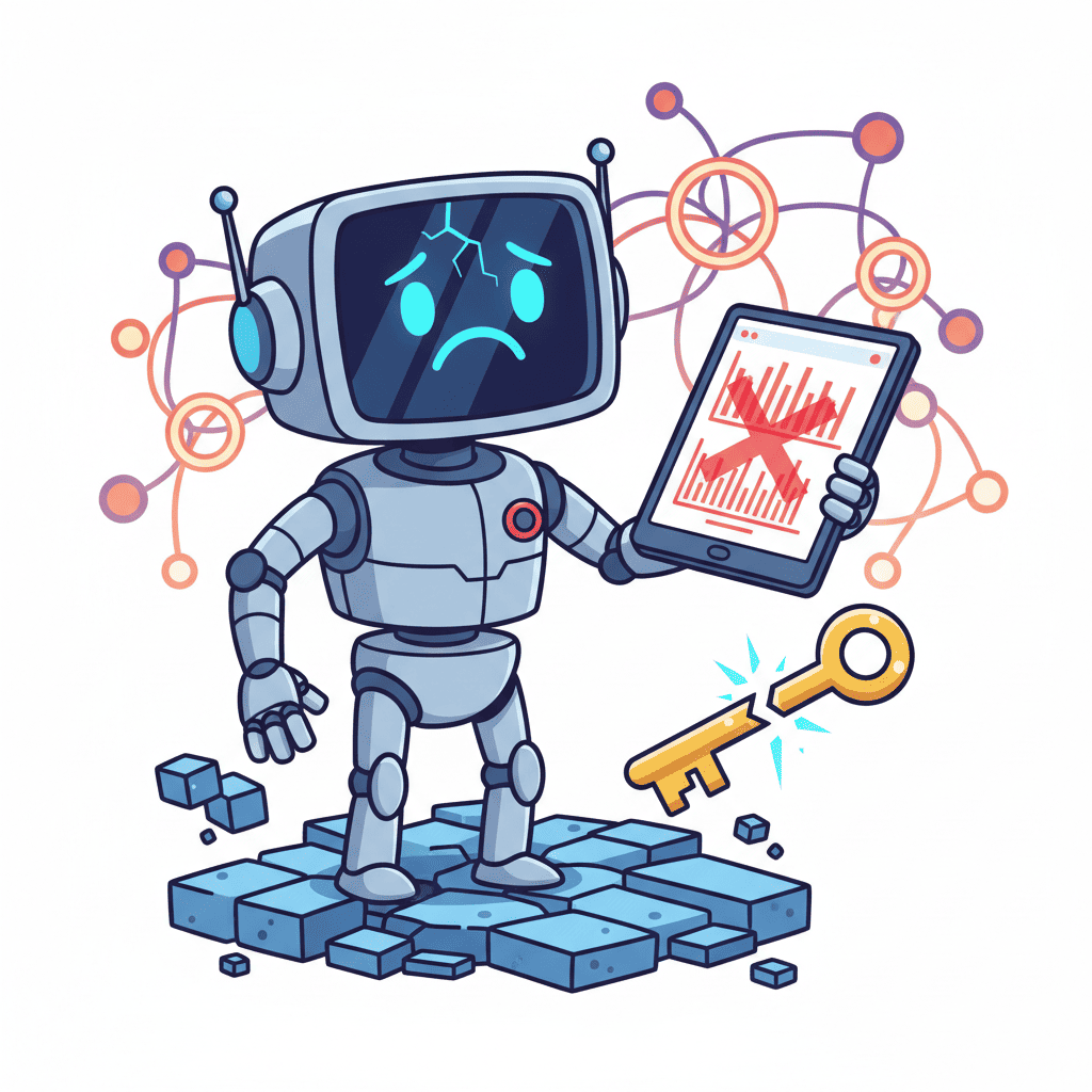
Here's a secret most AI app builders don't want to admit: your AI is basically lying to users all day long.
Not maliciously. But when your chatbot spits out "The answer is X" with the same confident tone whether it's 95% sure or pulling numbers from thin air—that's a trust problem. And in 2026, users are catching on.
AI confidence indicators UI patterns are becoming non-negotiable. They're the difference between apps users trust and apps users abandon after one hallucination too many.
Key Takeaways:
- Confidence indicators show users HOW CERTAIN your AI is—not just what it thinks
- Color-coded thresholds (green/yellow/red) reduce support tickets by showing uncertainty upfront
- 15+ copy-paste prompts for progress bars, badges, and source citations that build real trust
In This Article
- Why Your AI UI Is Secretly Killing Trust
- What Are Confidence Indicators?
- Color-Coded Confidence Prompts
- Progress Bar Prompts
- Source Citation Components
- Regeneration UI Prompts
- Accessibility Considerations
- FAQ
Why Your AI UI Is Secretly Killing Trust
I've tested dozens of AI-powered apps over the past year. Want to know what they all had in common?

They presented every answer like gospel truth.
Ask ChatGPT a question and it'll confidently tell you the capital of a country that doesn't exist. Ask your AI dashboard for a sales prediction and it'll give you numbers down to two decimal places—whether it has solid data or is basically guessing.
This is the core problem with AI confidence indicators UI patterns in 2026: AI doesn't naturally express uncertainty, so your UI has to do it for them.
Here's what happens when you don't:
- Users trust wrong answers (because nothing told them not to)
- Users distrust correct answers (because the last three were wrong)
- Support tickets pile up ("your AI said X but X was totally wrong")
The fix isn't complicated. You just need to visualize what the AI actually knows versus what it's inferring.
What Are Confidence Indicators? (The Quick Version)
Confidence indicators are UI elements that communicate how certain your AI is about its output.
Think of it like a weather app. When it says "90% chance of rain," you bring an umbrella. When it says "30% chance"—maybe, maybe not. The percentage changes your behavior.
AI outputs work the same way. A confidence indicator might be:
| Type | Example | Best For |
|---|---|---|
| Percentage badge | "87% confident" | Precise predictions |
| Color coding | Green/yellow/red border | Quick visual scanning |
| Progress bar | Filled bar at 60% | Data analysis results |
| Verbal label | "High confidence" / "Low confidence" | Non-technical users |
| Source count | "Based on 47 sources" | Research/RAG applications |
The goal isn't accuracy theater. It's giving users the information they need to decide whether to act on the AI's suggestion or dig deeper.
And honestly? This is the part most AI UI tutorials skip entirely.
Color-Coded Confidence Thresholds (The Traffic Light Pattern)
The simplest confidence pattern is one everyone already understands: green means go, yellow means caution, red means stop.
Here's a prompt that generates a confidence badge component with automatic color thresholds:
Create a React confidence badge component with these specs:
- Props: confidenceScore (0-100), label (string)
- Color thresholds:
  - 80-100%: green (#22c55e) - "High Confidence"
  - 50-79%: yellow (#eab308) - "Medium Confidence"
  - Below 50%: red (#ef4444) - "Low Confidence"
- Show both the percentage AND the verbal label
- Rounded pill shape with subtle shadow
- Include pulse animation for scores above 90%
- Use Tailwind CSS
- Add aria-label for accessibility
Want to try this yourself?
This gives you the foundation. But here's my hot take: don't just slap confidence badges everywhere.
Use them strategically:
- On AI-generated recommendations that lead to actions
- On predictions that affect decisions (forecasts, estimates)
- On synthesized information where the AI combined multiple sources
Skip them on deterministic outputs (formatting text, basic calculations) where confidence is always 100%.
Prompt for a Full Confidence Card
Need something more substantial? This prompt generates an entire card that wraps AI output:
Build a React AI response card with built-in confidence visualization:
- Card with AI-generated text content area
- Right side: vertical confidence meter (0-100)
- Bottom: "Based on X sources" with clickable list
- Color-coded border based on confidence level
- Subtle warning icon when below 50%
- "Regenerate" button appears when confidence < 40%
- Tailwind + shadcn styling
- Include TypeScript types
The key insight here is combining multiple signals. A confidence percentage PLUS source count PLUS a regenerate option when needed. Layered trust.
Progress Bars and Percentage Displays
Sometimes you need something more visual than a badge. Progress bars work great for dashboards where users are scanning multiple AI outputs at once.
Here's what works:
Create a horizontal confidence progress bar component:
- Props: score (0-100), title (string), description (optional)
- Gradient fill: red (0%) → yellow (50%) → green (100%)
- Animated fill on mount
- Show exact percentage on hover
- Title above bar, description below
- Compact variant for tables (just bar, no labels)
- Use Tailwind CSS with smooth transitions
- Support dark mode colors
Want to try this yourself?
Pro tip: the gradient approach is psychologically effective because users can visually gauge "how green" the bar is without reading numbers.
Multi-Score Display Prompt
When your AI returns multiple confidence metrics (like relevance + accuracy + recency), use this:
Create a multi-metric confidence display:
- Props: metrics array [{name, score, icon}]
- Horizontal layout: icon → label → mini progress bar
- Stack vertically on mobile
- Overall score at bottom (average with weighting option)
- Expandable details on click
- Use Lucide icons, Tailwind, shadcn
This pattern works brilliantly for AI search results, document analysis, or any RAG application.
Source Citation Components (The Trust Multiplier)
Here's something I learned the hard way: confidence percentages alone don't build trust. Users want to know why the AI is confident.
Source citations fix this. They transform "87% confident" into "87% confident based on these 5 documents."
Build a source citation panel component:
- Collapsible section titled "Sources (X)"
- List of sources with: title, URL, relevance score (1-5 dots)
- "Most relevant" badge on top source
- Favicon display if URL is external
- "Copy citation" button per source
- Timestamp showing when each source was accessed
- Use Tailwind with subtle borders between items
Want to try this yourself?
Inline Citation Prompt
For AI-generated text that references specific sources inline (like research summaries):
Create an inline citation component:
- Superscript number that triggers tooltip on hover
- Tooltip shows: source title, one-line summary, link
- Numbers auto-increment across the content
- "View all sources" link at bottom
- Styling: subtle blue superscript, non-intrusive hover
- React with TypeScript
This is the pattern behind every credible AI research tool. If your AI synthesizes information, users need to trace claims back to sources.
When to Show Regeneration Options
Low confidence shouldn't be a dead end. Give users an escape hatch.
The question is: when should the "Try Again" button appear?
My rule of thumb:
Here's the prompt for a regeneration-aware response component:
Build an AI response component with smart regeneration:
- Display AI text with confidence badge
- When confidence < 40%: show yellow warning bar + "Not confident? Try a different prompt" button
- When confidence 40-70%: show subtle "Regenerate" link at bottom
- When confidence > 70%: hide regeneration UI entirely
- Include loading state for regeneration
- Props: content, confidence, onRegenerate callback
- Tailwind + shadcn styling
The psychological trick here is framing. "Not confident? Try a different prompt" puts the user in control. It's collaborative, not apologetic.
Advanced: Guided Improvement Prompt
Even better than a basic regenerate button:
Create a guided improvement modal that appears on low confidence:
- Modal title: "Help me do better"
- 3 suggestion chips: "More specific", "Add context", "Different angle"
- Free-text input for additional instructions
- "Regenerate with suggestions" button
- Subtle micro-interaction on chip selection
- Dismiss option: "Keep this response"
This turns low confidence from a failure into a conversation. Users feel like partners, not victims of bad AI.
Accessibility for Dynamic Confidence Content
Here's where most AI confidence indicators UI implementations fail: accessibility.
Dynamic content that updates without warning is a nightmare for screen readers. If your confidence indicator changes from green to red, users need to know.
Must-have accessibility features:
- ARIA live regions for confidence score updates
- Color + icon (never color alone) for colorblind users
- Text alternatives for all visual confidence indicators
- Focus management when regeneration completes
This prompt handles the basics:
Create an accessible confidence indicator component:
- aria-live="polite" for score changes
- Include icon (checkmark/warning/error) alongside color
- Visible text label in addition to visual progress
- aria-describedby linking to explanation text
- Keyboard navigable tooltip for additional details
- High contrast mode support
- Use Tailwind with forced-colors media query
For a deeper dive on building accessible AI components, check out our WCAG compliance guide.
Testing Accessibility Prompt
Add this to your testing workflow:
Add accessibility tests to the confidence indicator:
- Jest test: renders aria-label with score
- Jest test: icon changes based on threshold
- Jest test: aria-live announces updates
- Manual checklist in comments for keyboard navigation
- Color contrast check against WCAG 2.1 AA
Putting It All Together: Complete Implementation
Let's combine everything into a production-ready pattern. Here's a prompt for a full AI response wrapper:
Build a complete AI response card with trust indicators:

Components:
1. Header: AI model name + timestamp + "confidence: X%"
2. Main content: rendered markdown from AI
3. Inline citations: superscript numbers linking to sources
4. Confidence bar: gradient progress bar below content
5. Source panel: collapsible list of sources with relevance dots
6. Actions: Copy, Share, Regenerate (conditional)

Behavior:
- Regenerate button appears only when confidence < 50%
- Warning banner at top when confidence < 30%
- Pulse animation on high confidence (>90%)
- Accessible: aria-live on score, icons + colors

Tech: React, TypeScript, Tailwind, shadcn components
Want to try this yourself?
This is the kind of component you can drop into any AI-powered app and immediately boost user trust.
For more AI UI prompts covering every component type, check out our complete template collection.
You Might Also Like
- AI Dashboard Prompts: 40+ Templates for Admin Panels - Add confidence indicators to your analytics dashboards
- AI Skeleton Loaders: Prompts That Kill Spinners - Pair confidence UI with better loading states
- The Complete Vibe Coding Guide (2026) - Master AI-powered development from scratch
Frequently Asked Questions
What are AI confidence indicators in UI design?
AI confidence indicators are visual elements that communicate how certain an AI system is about its output. They range from simple percentage badges to complex source citation panels. The goal is helping users understand when to trust AI suggestions versus when to verify independently.
How do I display AI confidence levels to users?
The most effective approaches combine multiple signals: a percentage or verbal label ("High/Medium/Low"), color coding (green/yellow/red), and source attribution. Show these alongside AI outputs, not hidden in settings. For low-confidence outputs, add regeneration options.
Should I always show confidence scores in AI apps?
No. Show confidence indicators on predictions, recommendations, and synthesized content where certainty matters. Skip them on deterministic operations (formatting, calculations) where the AI is always correct. Over-indicating creates noise and actually reduces trust.
What confidence threshold should trigger a warning?
Most applications use 50% as the warning threshold and 30% as the "proceed with caution" level. But this depends on your use case—medical or financial applications might warn at 70%. Test with users to find the right balance for your domain.
How do I make confidence indicators accessible?
Always pair color with icons or patterns (for colorblind users), add aria-live regions for dynamic updates, provide text alternatives for visual indicators, and ensure keyboard navigation works for interactive elements like regeneration buttons.
Written by the Fardino Team. We build AI tools for frontend developers. Try Fardino free →
