AI Navbar & Footer Prompts: 40+ Templates
Let me tell you something nobody mentions in vibe coding tutorials: your landing page can be stunning, your dashboard pixel perfect, your forms beautifully validated—but if your navbar looks like a Bootstrap template from 2016? The whole thing falls apart.

Let me tell you something nobody mentions in vibe coding tutorials: your landing page can be stunning, your dashboard pixel-perfect, your forms beautifully validated—but if your navbar looks like a Bootstrap template from 2016? The whole thing falls apart.
I've built over 200 pages using AI tools. And for the longest time, the navigation and footer were my weakest links. Not because AI can't generate them, but because most prompts suck.
Key Takeaways:
- Simple prompts create generic navbars—specificity is what gets you professional results
- Footer prompts need explicit section structure or AI will miss critical elements
- Combining navbar and footer prompts with cohesive styling creates polished, consistent layouts
In This Article
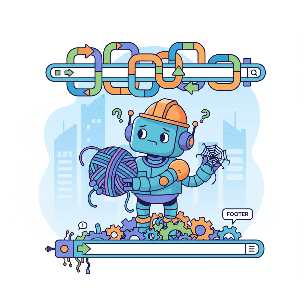
- Why Navigation & Footers Are Harder Than They Look
- Part 1: AI Navbar Prompts That Work
- Part 2: AI Footer Prompts That Convert
- Part 3: Combining Header & Footer
- FAQ
Why Navigation & Footers Are Harder Than They Look
Here's my hot take: navbars and footers are deceptively complex. They seem simple—a logo, some links, maybe a button. But throw in mobile responsiveness, sticky behavior, mega menus, and suddenly you're debugging z-index issues at 2am.

The problem with most AI navbar prompts is they're too vague. "Create a navbar" gives you something that works. "Create a responsive navbar with logo left, centered nav links with hover underline animation, and a CTA button that changes color on scroll" gives you something that ships.
Same with footers. They're not just the bottom of your page—they're where users go when they're lost, looking for contact info, or checking your legitimacy. A bad footer kills trust.
Let's fix both.
Part 1: AI Navbar Prompts That Work
1.1 Simple Navbar (Logo + Links)
Start here if you need something clean. These prompts generate minimal navbars that don't try to do too much.
Basic Clean Navbar:
Minimal Dark Navbar:
Want to try this yourself?
Startup Navbar with CTA:
1.2 Dropdown Navigation Prompts
When you've got more than 6 top-level items, dropdowns save the day. The trick is specifying exactly what goes where.
Simple Dropdown Navbar:
E-commerce Category Navbar:
1.3 Mega Menu Prompts
Mega menus are where things get interesting. Here's where you need to be really specific or AI will give you a mess.
SaaS Mega Menu:
Want to try this yourself?
Agency Portfolio Mega Menu:
1.4 Mobile-First Hamburger Menu
Mobile navigation is where most AI-generated navbars break. These prompts focus on the mobile experience.
Smooth Slide-In Menu:
Full-Screen Mobile Menu:
Bottom Mobile Navigation:
1.5 Sticky/Transparent Header Prompts
Headers that change on scroll add that professional polish. But you need to specify the transitions.
Transparent to Solid Navbar:
Shrinking Sticky Header:
Hide on Scroll Down, Show on Scroll Up:
Part 2: AI Footer Prompts That Convert
Footers matter more than most people think. When someone scrolls to the bottom, they're either done or looking for something specific. Give them what they need.
2.1 Minimal Footer Prompts
Sometimes less is more. These work great for apps, tools, and simple marketing sites.
Super Simple Footer:
Clean Two-Row Footer:
2.2 Multi-Column Footer Layout
The classic footer layout. Specify your columns or AI will guess.
4-Column Footer:
Want to try this yourself?
SaaS Footer with App Downloads:
2.3 Footer with Newsletter Signup
Newsletter footers are conversion machines when done right.
Newsletter-Focused Footer:
Blog Footer with Categories:
2.4 Footer with Social Links & Legal
For sites that need to tick compliance boxes.
Enterprise Footer:
Creative Agency Footer:
Part 3: Combining Header & Footer
Here's the thing nobody tells you—your navbar and footer need to feel like they belong together. Same fonts, same color values, same spacing system.
3.1 Cohesive Design System Prompts
Matched Header/Footer Pair:
Dark Theme Header/Footer:
3.2 Complete Page Layout Prompts
Sometimes you want it all at once.
Complete Landing Page Frame:
Want to try this yourself?
Quick Reference: Prompt Elements Cheatsheet
| Element | What to Specify | Example |
|---|---|---|
| Logo | Position, size, light/dark versions | "Logo left, 32px height, white on dark bg" |
| Nav Links | Count, names, alignment | "5 links centered: Home, Features, Pricing, About, Contact" |
| CTA Button | Text, color, position | "Blue 'Get Started' button on right" |
| Mobile Menu | Type, animation, position | "Hamburger, slides from right, 80% width" |
| Scroll Behavior | Effect, trigger point | "Solid white background after 100px scroll" |
| Footer Columns | Number, content per column | "4 columns: Product, Company, Resources, Legal" |
| Newsletter | Position, fields, button | "Email input + Subscribe button in footer top" |
You Might Also Like
- AI Landing Page Prompts: 50+ Templates That Actually Work - Combine these navbar/footer prompts with hero sections and feature blocks for complete pages.
- AI Modal Prompts: 30+ Templates That Convert - Add login modals and notification popups to your navigation flows.
- Vibe Coding Best Practices: The Complete Guide for 2025 - Level up your overall vibe coding workflow with these battle-tested practices.
Frequently Asked Questions
How do I generate a responsive navbar with AI?
The key is specifying both desktop AND mobile behavior in your prompt. Tell the AI exactly what happens on mobile—hamburger icon position, how the menu opens (slide, overlay, accordion), and which elements are hidden. Vague prompts get vague results.
What prompts work best for navigation menus?
Prompts that specify: link names, their positions (left/center/right), any dropdowns and their contents, mobile behavior, scroll effects, and color scheme. The more specific you are about interactions and transitions, the better the output.
What should a website footer include?
At minimum: logo, navigation links, copyright notice. For most sites, also include: contact information, social links, legal pages (privacy/terms), and a newsletter signup. Enterprise sites need: multiple link columns, regional selectors, trust badges, and accessibility links.
How do I make navbar and footer look consistent?
Use the same colors, fonts, spacing values, and border radii. Either generate them together in one prompt specifying shared design tokens, or create a "style guide" section in each prompt listing the exact same values.
Can AI generate mega menus?
Yes, but you need detailed prompts. Specify: how many columns, what goes in each column (icons? descriptions? images?), animation behavior, and how the mega menu closes. Without this detail, you'll get a basic dropdown instead.
The navbar and footer might seem like small details. But they're the frame around everything else you build. Get them right, and your AI-generated pages start looking like they were built by a design team, not generated in 30 seconds.
Now take these prompts and actually use them. Customize the colors, swap out the link names, make them yours. That's the whole point.
Written by the Fardino Team. We build AI tools for frontend developers. Build with Fardino →
Got an idea? Build it now.
Describe the site or app you want — Fardino turns it into a live website.


