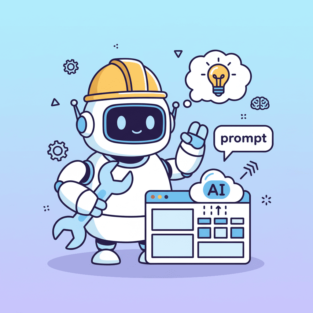
Build a Startup Landing Page with AI (Prompts That Work)
Here's a stat that should wake you up: 25% of Y Combinator's Winter 2025 batch built their startups with 95% AI generated code. Not prototypes. Not demos. Production apps that raised millions. If you're still hand coding your startup landing

Here's a stat that should wake you up: 25% of Y Combinator's Winter 2025 batch built their startups with 95% AI-generated code.
Not prototypes. Not demos. Production apps that raised millions.
If you're still hand-coding your startup landing page, you're working harder, not smarter. The founders who are shipping fast figured out something most developers miss: building a startup landing page with AI isn't about writing one magical prompt. It's about knowing which prompts to use for each section.
I've spent the last few months building landing pages with AI tools, and honestly? Most of my early attempts were embarrassing. Generic hero sections. Pricing tables that looked like Excel spreadsheets. CTAs that screamed "I was generated by a robot."
But I cracked the code. And I'm going to share the exact workflow that works.
Key Takeaways:
- Build section-by-section, not all at once (one prompt per section)
- Include specific design details in every prompt (colors, spacing, style)
- Your hero section prompt needs a unique value proposition, not generic startup fluff
- Social proof and testimonials require the most iteration—plan for it
In This Article
- The Startup Landing Page Blueprint
- Hero Section Prompts
- Features Section Prompts
- Social Proof Prompts
- Pricing Table Prompts
- FAQ Section Prompts
- CTA & Footer Prompts
- Common Mistakes
- Copy-Paste Template
- FAQ
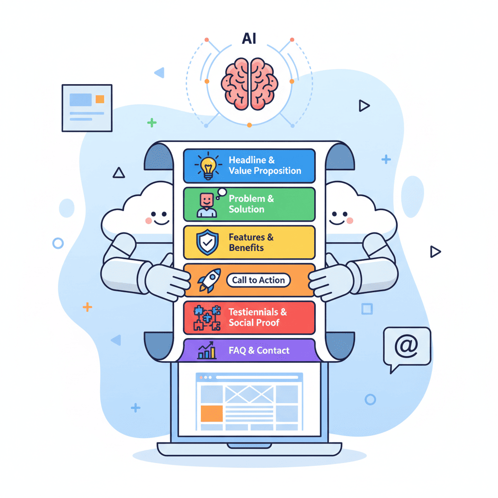
The Startup Landing Page Blueprint: 7 Sections You Actually Need
Before we dive into prompts, let's talk about what makes a startup landing page convert. Not what makes it pretty—what makes people actually sign up.
| Section | Purpose | Priority |
|---|---|---|
| Hero | Hook visitors in 3 seconds | Critical |
| Social Proof | Build trust immediately | Critical |
| Features/Benefits | Show what you do | High |
| How It Works | Reduce friction | Medium |
| Pricing | Qualify leads | High |
| FAQ | Handle objections | Medium |
| CTA + Footer | Final conversion push | High |
Here's the thing: most people try to generate all of this in one prompt. Don't. That's how you get a Frankenstein page that looks like it was designed by committee.
Build section by section. Each prompt should focus on one thing and do it well.
If you want a deeper library of prompts for each section type, check out our 50+ AI landing page prompts guide. But for now, let's focus on the startup-specific workflow.
Step 1: Hero Section Prompts That Don't Suck
The hero section is where most AI-generated pages fall apart. Generic headlines. Stock photo vibes. Weak value propositions.
Here's what actually works:
Why this works: You're giving the AI specific constraints. Background color, CTA text, layout structure, responsive breakpoints. The more specific you are, the less the AI hallucinates.
The secret nobody tells you: Write your actual headline first. If you let the AI write "Transform Your Workflow with AI-Powered Solutions," you'll get exactly that garbage. Your headline should be specific to YOUR product.
Bad: "The Future of Project Management" Good: "Ship 3x Faster with AI Sprint Planning"
Want to try this yourself?
Step 2: Features Section Prompts (With Icons)
Features sections are easier to get right, but there's still a technique to it. Most AI-generated feature sections look like documentation pages. Boring grids. No visual hierarchy.
Try this instead:
I'm not going to lie—this is where following vibe coding best practices really matters. The more context you give about your actual features, the better the output.
Step 3: Social Proof and Testimonials
This is the hardest section to nail with AI. Why? Because AI doesn't know your customers.
Here's my workflow:
Hot take: Never ship with AI-generated testimonials. Use the layout, replace the content with real feedback. Fake testimonials are legal gray area and, frankly, your users can smell them.
For the logo bar (which you absolutely should add):
Step 4: Pricing Table Prompts
Pricing tables are where AI actually shines. The structure is predictable, so prompts tend to work well on the first try.
Want to try this yourself?
Step 5: FAQ Section Prompts
FAQs are easy to generate but often overlooked. They serve two purposes: handle objections and boost SEO (hello, featured snippets).
Pro tip: Use your actual customer questions. Check your support inbox or Intercom. Those are the objections you need to handle.
Step 6: CTA and Footer Prompts
Your final CTA is the last chance to convert. Don't phone it in.
For the footer:
5 Mistakes That Kill Startup Landing Pages
I've made all of these. Learn from my pain.
| Mistake | What Happens | The Fix |
|---|---|---|
| One mega-prompt | Frankenstein page with no cohesion | Build section by section |
| Generic headlines | "Transform your workflow" vibes | Write your headline first, then prompt |
| No social proof | Zero trust signals | Add logos and testimonials early |
| Ignoring mobile | 60%+ users bounce | Always specify responsive breakpoints |
| Skipping iteration | First output is never shippable | Plan 2-3 iterations per section |
If you want to avoid these pitfalls in detail, I wrote an entire piece on common vibe coding mistakes that covers the debugging side of things.
The Complete Copy-Paste Template
Here's the full workflow condensed. Adjust to your startup:
- Start with your hero. Get the headline and value prop locked before anything else.
- Add features and benefits. Be specific about your actual product.
- Drop in social proof. Even if it's placeholder—structure matters.
- Build the pricing table. Include the toggle and highlight your recommended tier.
- Finish with CTA and footer. Don't forget the final conversion push.
Each section: one prompt. Iterate until it's right. Then move to the next.
Ship It
Here's the real secret: the founders building fast aren't using magic AI tools. They're using the same tools as everyone else. The difference? They've stopped trying to generate entire pages in one shot. They build section by section, prompt by prompt, with enough specificity that the AI doesn't have to guess.
When you're ready to build your startup landing page with AI, remember: the prompt is only as good as the context you provide. Give it your headline. Give it your features. Give it your colors.
And when something looks off? Iterate. The best AI-generated pages are the ones where the human knew exactly what they wanted.
Now stop reading and go ship something.
You Might Also Like
- AI Landing Page Prompts: 50+ Templates That Actually Work - Grab more prompts for every section type
- Vibe Coding Best Practices: The Complete Guide for 2025 - Level up your overall AI coding workflow
- 10 Vibe Coding Mistakes That Kill Your Projects - Avoid the traps that sink most projects
Frequently Asked Questions
How long does it take to build a startup landing page with AI?
If you know your content (headline, features, pricing), you can have a shippable page in 2-3 hours. The prompting is fast—it's the iteration and content decisions that take time.
Can AI build a good startup website?
Yes, with caveats. AI excels at structure, layout, and styling. It struggles with your unique value proposition and messaging. Write your copy first, then prompt the AI to build around it.
What prompts work best for AI landing pages?
Section-specific prompts with clear constraints: colors, layout, responsive behavior, specific content. Avoid vague prompts like "create a beautiful landing page."
Which AI tool should I use for startup landing pages?
Any modern AI UI builder works—the technique matters more than the tool. The section-by-section approach works regardless of which platform you use.
How do I make my AI-generated page not look generic?
Three things: (1) Write your own headline, don't let AI generate it, (2) Use a specific color palette from day one, (3) Add real social proof—logos, testimonials, metrics.
Written by the Fardino Team. We build AI tools for frontend developers. Build with Fardino →
Got an idea? Build it now.
Describe the site or app you want — Fardino turns it into a live website.


