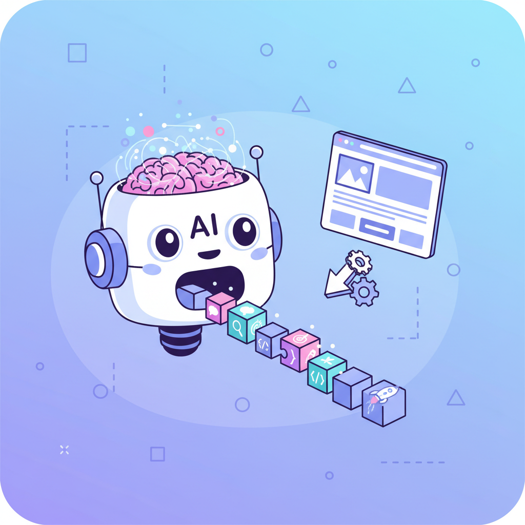
KI Landing Page Prompts: 50+ Vorlagen, die wirklich funktionieren
Du hast eine zündende Produktidee, der Deadline Druck sitzt dir im Nacken – und null Lust, drei Tage lang CSS Abstände zu debuggen. Kenn ich. Genau deshalb sind KI Landing Page Prompts zur Geheimwaffe für Entwickler und Gründer geworden, die

Du hast eine zündende Produktidee, der Deadline-Druck sitzt dir im Nacken – und null Lust, drei Tage lang CSS-Abstände zu debuggen. Kenn ich. Genau deshalb sind KI Landing Page Prompts zur Geheimwaffe für Entwickler und Gründer geworden, die tatsächlich etwas shippen.
Aber hier kommt das, was die meisten verschweigen: Die Mehrheit der Leute nutzt diese Tools komplett falsch. Sie tippen „mach mir eine Landing Page" und wundern sich dann, warum sie generischen Einheitsbrei bekommen, der wie jedes x-beliebige SaaS-Template aus dem Jahr 2019 aussieht.
Der Unterschied zwischen einer Landing Page, die konvertiert, und einer, bei der Besucher sofort den Zurück-Button drücken? Alles steckt im Prompt. Und ich gebe dir gleich über 50 Vorlagen, die ich persönlich getestet, verfeinert und eingesetzt habe – für Landing Pages, bei denen man denkt, ein Designer hätte sie angefasst.
Warum deine KI-Prompts wahrscheinlich scheitern
Direkt gesagt: Wenn du von KI-Landing-Page-Generatoren mittelmäßige Ergebnisse bekommst, liegt das Problem bei deinen Prompts. Nicht am Tool. Nicht am KI-Modell. An deinen Prompts.
Ich habe Entwickler gesehen, die stundenlang KI-generierten Code „repariert" haben – dabei hätten sie mit einem besseren Prompt beim ersten Versuch 90 % erreicht. Das ist, als würdest du den Hammer beschimpfen, wenn du einen schiefen Nagel eingeschlagen hast, weil du ihn am falschen Ende gehalten hast.
Typische Fehler im Überblick:
| Häufiger Fehler | Warum er scheitert | Besserer Ansatz |
|---|---|---|
| Zu vage („mach eine Landing Page") | KI hat keine Richtung, greift auf zufällige Defaults zurück | Branche, Stil und wichtige Abschnitte angeben |
| Zu lang (500+ Wörter) | KI verliert den Faden, ignoriert Teile | Fokussiert bleiben, 50–150 Wörter sind optimal |
| Keine visuellen Referenzen | KI rät deine Ästhetik-Vorstellungen | Konkrete Stile, Farben und Inspirationen nennen |
| Fehlender Kontext | Generisches Ergebnis, das zu nichts passt | Markenstimme, Zielgruppe und Kernvorteile einbeziehen |
Die gute Nachricht: Sobald du die Grundlagen des Vibe Coding verstanden hast, wird effektives Prompten zur zweiten Natur.
Der Aufbau eines perfekten KI-Prompts für Landing Pages
Bevor ich dir 50 Vorlagen hinwerfe, lass uns aufdröseln, was einen KI-Prompt wirklich zum Laufen bringt. Stell dir das wie ein Rezept vor – fehlende Zutaten bedeuten Chaos im Ergebnis.

Die Formel, die ich für jeden Landing-Page-Prompt verwende:
Die 5 Elemente eines starken Prompts:
- Komponenten-Typ — Was baust du genau? (Hero-Section, Preistabelle usw.)
- Visueller Stil — Modern? Minimalistisch? Ausdrucksstark? Referenz-Sites helfen
- Kerninhalt — Headlines, CTAs, konkreter Copy-Text
- Technische Vorgaben — React, Tailwind, Responsive-Anforderungen
- Besondere Wünsche — Animationen, Dark Mode, spezifische Interaktionen
Fehlt einer dieser Punkte, spielst du Lotterie mit dem Output. Schauen wir uns das in echten Vorlagen an.
Hero-Section-Prompts, die den Scroll stoppen
Die Hero-Section entscheidet, ob eine Landing Page gewinnt oder verliert. Du hast ungefähr drei Sekunden, um jemanden davon zu überzeugen, nicht sofort wegzuklicken. Kein Stress.
Vorlage 1: Der SaaS-Klassiker
Selbst ausprobieren?
Vorlage 2: Die Mut-zur-Aussage-Hero
Vorlage 3: Die Social-Proof-Hero
Vorlage 4: Die Video-Hero
Feature-Section-Prompts, die Nutzen verkaufen
Hier eine unbequeme Wahrheit: Die meisten Feature-Sections sind öde Listen, die niemand liest. Sie zählen Funktionen auf, anstatt Ergebnisse zu verkaufen. Deine Prompts sollten das widerspiegeln.
Vorlage 5: Das Bento-Grid
Selbst ausprobieren?
Vorlage 6: Das Wechsellayout
Vorlage 7: Das Icon-Raster
Vorlage 8: Der Feature-Vergleich
Preistabellen-Prompts, die konvertieren
Preisseiten sind echte Konversions-Schlachtfelder. Wer sie vermasselt, lässt bares Geld liegen. Das funktioniert:
Vorlage 9: Der Drei-Stufen-Klassiker
Vorlage 10: Die Vergleichstabelle
| Feature | Starter | Pro | Enterprise |
|---|---|---|---|
| Projekte | 3 | Unbegrenzt | Unbegrenzt |
| Teammitglieder | 1 | 10 | Unbegrenzt |
| Speicher | 1 GB | 50 GB | 500 GB |
| Support | Priorität | Dediziert | |
| Preis | Kostenlos | €29/Monat | Auf Anfrage |
Vorlage 11: Die wertfokussierte Preisseite
Testimonial-Sections, die Vertrauen aufbauen
Social Proof ist kein Nice-to-have mehr. Aber es gibt einen richtigen Weg – und einen, den du besser meiden solltest.
Vorlage 12: Das Testimonial-Karussell
Vorlage 13: Die Wall of Love
Vorlage 14: Die Case-Study-Karte
CTA-Sections, die zum Handeln bewegen
Hier fragst du nach dem Abschluss. Wenn das schiefläuft, war alles andere umsonst.
Vorlage 15: Der finale Schubs
Selbst ausprobieren?
Vorlage 16: Der E-Mail-Capture-CTA
DSGVO-Hinweis: Vergiss nicht, in deinen generierten Formularen einen Opt-in-Hinweis und den Link zur Datenschutzerklärung zu ergänzen. KI-generierter Code lässt das gerne weg – und das kann teuer werden.
Vorlage 17: Der doppelte CTA
Vollständige Landing-Page-Vorlagen
Manchmal willst du alles auf einmal. Hier sind meine bewährtesten Komplettpakete:
Vorlage 18: Die vollständige SaaS-Landing-Page
Vorlage 19: Die Startup-Launch-Page
Fehler, die deine Ergebnisse ruinieren
Ich habe alle gemacht. Lern aus meinen Umwegen:
- Mobile vergessen — Immer ergänzen: „Make fully responsive. Stack on mobile."
- Nichtssagender Copy — „Willkommen auf unserer Plattform" sagt rein gar nichts. Konkret werden.
- CTA-Chaos — Eine Seite, eine Hauptaktion. Punkt.
- Zu wenig Weißraum — „Use generous spacing" ergänzen, sonst wirkt das Layout erdrückend.
- Flache Hierarchie — Der KI sagen, was dominiert: „Headline biggest, subtext smaller, CTA pops."
Für tiefergehende Techniken im Umgang mit KI-Tools, schau dir unseren Context-Engineering-Guide an.
Kurze Plattform-Tipps
Verschiedene KI-Tools haben verschiedene Stärken. v0 liebt Shadcn- und Radix-Komponenten – erwähne sie explizit. Lovable glänzt bei mehrseitigen Flows. 0xMinds ist auf React-Landing-Pages und Dashboards mit Tailwind optimiert. Die universelle Regel? Spezifität gewinnt überall.
Jetzt shippen
KI Landing Page Prompts sind nur so gut wie der Kontext, den du ihnen gibst. Vage rein, vage raus. Präzise rein, deployfertig raus.
Nimm diese Vorlagen, pass sie an deine Marke an und bau dir eine eigene Prompt-Bibliothek auf. Wenn du erst mal weißt, was funktioniert, wirst du es immer wieder einsetzen.
Jetzt hör auf zu lesen und bau endlich etwas.
Bereit, diese Prompts auszuprobieren? Mit Fardino loslegen →
Got an idea? Build it now.
Describe the site or app you want — Fardino turns it into a live website.


