Here's a brutal truth about AI SaaS landing pages: the average conversion rate is 3.8%. That means 96 out of every 100 visitors leave without doing anything.
Most prompts generate pages that look fine but convert like garbage. Generic hero sections. Vague feature lists. Pricing tables that confuse instead of convince.
Key Takeaways:
- SaaS pages need 6 sections: Hero, Features, Social Proof, Pricing, FAQ, and CTA
- The hero has 5 seconds to hook visitors—specificity beats generic claims
- Custom AI-generated designs outperform templates (11.6% vs 3.8% conversion)
- Mobile-first prompts matter—83% of traffic comes from phones
In This Article
- The 6 Sections Every SaaS Landing Page Needs
- Hero Section Prompts That Hook in 5 Seconds
- Features Section: Benefits Over Features
- Social Proof Prompts That Build Trust
- Pricing Section Prompts That Convert
- CTA Prompts That Actually Work
- Mobile-First: The Non-Negotiable
- Conversion Benchmarks to Aim For
- FAQ
I've built 15 SaaS landing pages with AI in the past month. The ones that hit 10%+ conversion all had something in common: prompts that focus on why someone should care, not what your product does.
This guide gives you section-by-section prompts for every part of a high-converting AI SaaS landing page. Each one is tested. Each one works.
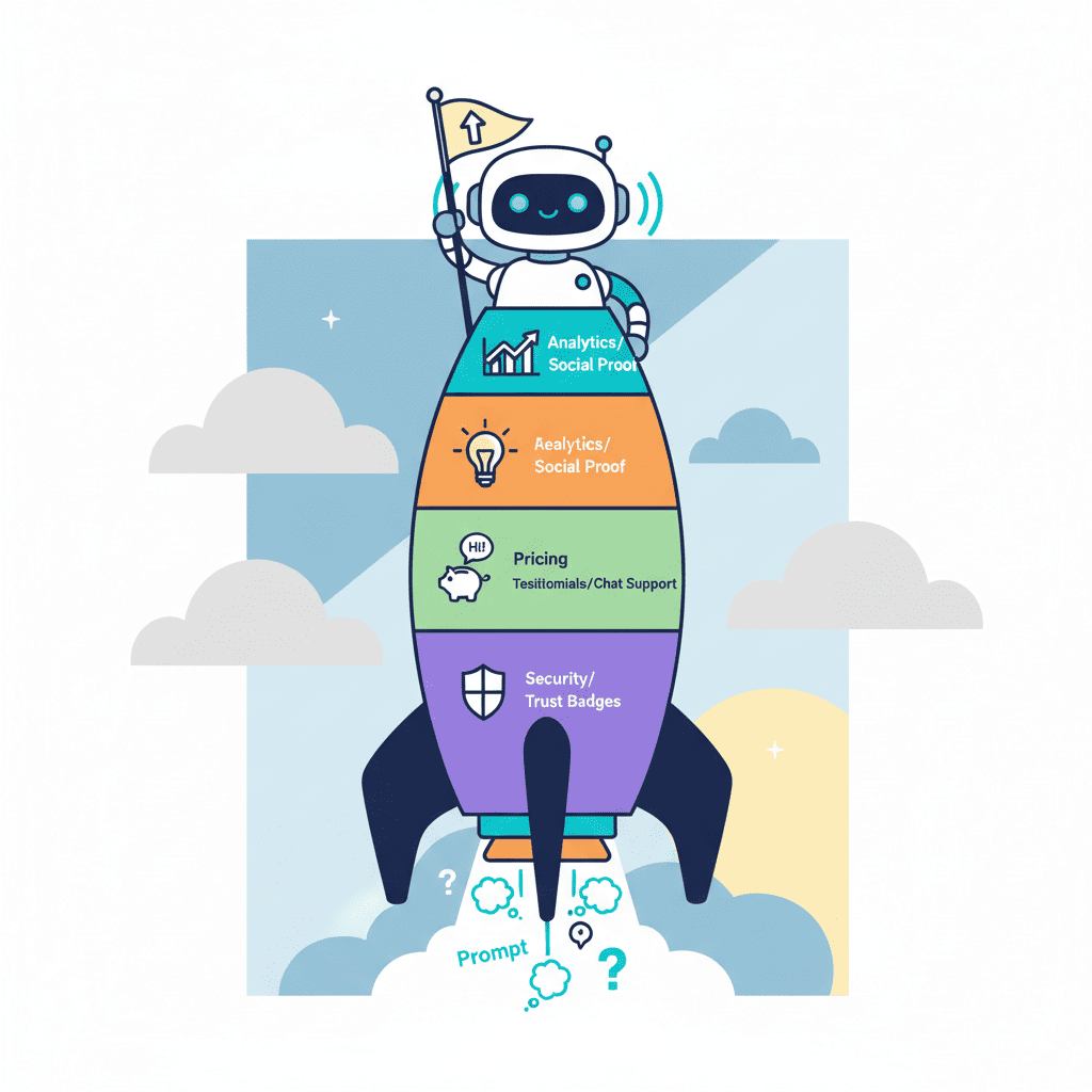
The 6 Sections Every SaaS Landing Page Needs
Before we get into prompts, let's talk structure. Top-converting SaaS pages follow a predictable pattern:
| Section | Purpose | Critical Element |
|---|---|---|
| Hero | Hook visitors in 5 seconds | Specific value proposition |
| Features | Show how you solve their problem | Benefits, not feature lists |
| Social Proof | Build credibility | Real testimonials, logos, numbers |
| Pricing | Remove friction | Transparent, clear tiers |
| FAQ | Handle objections | Address fears before they ask |
| Final CTA | Close the deal | Single, focused action |
Miss any of these, and you're leaving conversions on the table. Let's build each one.
Hero Section Prompts That Hook in 5 Seconds
Users decide whether to stay or bounce in 5-10 seconds. Your hero needs to answer one question instantly: "Is this for me?"
Here's the problem with most AI hero prompts—they're too generic. "Build an amazing hero section for my SaaS" generates something bland that could work for any product. And generic = forgettable.
The fix? Get specific about your audience and their pain point.
Hero Prompt Template
Create a SaaS hero section for [PRODUCT TYPE] targeting [SPECIFIC AUDIENCE].

Pain point: [THEIR MAIN FRUSTRATION]
Solution: [HOW YOU SOLVE IT IN ONE SENTENCE]

Requirements:
- Headline under 10 words that speaks directly to the pain
- Subheadline that explains the benefit (not features)
- Single primary CTA button with action-oriented text
- Optional secondary CTA (e.g., "Watch demo")
- Trust indicator below CTA (e.g., "No credit card required" or "14-day free trial")
- Background: gradient or subtle pattern, not busy imagery

Tech: React, Tailwind CSS
Real Example
Here's a prompt that actually converts:
Create a SaaS hero section for an email analytics tool targeting email marketers at B2B companies.

Pain point: They can't tell which emails actually drive revenue
Solution: Track email-to-revenue attribution without complex setup

Requirements:
- Headline under 10 words that speaks directly to the pain
- Subheadline explaining the ROI benefit
- Primary CTA: "Start Free Trial"
- Secondary CTA: "See It In Action"
- Trust indicator: "Works with Gmail, Outlook, and any ESP"
- Dark gradient background with subtle grid pattern

Tech: React, Tailwind CSS, Framer Motion for subtle animations
Want to try this yourself?
Notice how specific the prompt is. "Email marketers at B2B companies" is different from "email marketers." "Can't tell which emails drive revenue" is different from "email analytics."
Specificity is the difference between 3.8% and 10%+ conversion.
For more hero section prompt patterns, check out our AI hero section prompts guide.
Features Section: Benefits Over Features
This is where most SaaS pages lose people. They list features nobody cares about.
"Real-time sync." So what? "Enterprise-grade encryption." Cool, but why does that matter to me?
The fix: translate every feature into a benefit. Real-time sync becomes "Your whole team sees changes instantly—no more version conflicts." Enterprise-grade encryption becomes "Your data stays yours. Period."
Features Section Prompt
Create a SaaS features section using a bento grid layout.

Product: [YOUR PRODUCT]
Target audience: [WHO USES IT]

Include 4-6 feature cards:
For each feature, I'll give you the feature—translate it into a user benefit.

Features to translate:
1. [FEATURE 1]
2. [FEATURE 2]
3. [FEATURE 3]
4. [FEATURE 4]

Requirements:
- Bento grid layout (mixed sizes for visual hierarchy)
- Each card has: icon, benefit-focused headline, 1-2 sentence description
- One card should be larger/featured (your main differentiator)
- Subtle hover animations
- Icons should be functional, not decorative

Tech: React, Tailwind CSS, Lucide icons
Feature-to-Benefit Translation Cheat Sheet
| Feature | Benefit Translation |
|---|---|
| "Automated workflows" | "Set it up once, never think about it again" |
| "Real-time analytics" | "Know what's working before your competitors do" |
| "Integrates with 50+ tools" | "Works with everything you already use" |
| "AI-powered insights" | "Get recommendations, not just data" |
| "99.9% uptime" | "Always on when you need it" |
The pattern: features describe what your product does. Benefits describe what your user gets.
Social Proof Prompts That Build Trust
Here's an uncomfortable stat: 83% of users trust recommendations from people over brand messaging. If your landing page is all "we" and no "they," you're fighting uphill.
Social proof comes in three flavors: testimonials, logos, and numbers. Use all three.
Testimonials Prompt
Create a testimonial section for a SaaS landing page.

Include:
- 3 testimonial cards with photo, name, title, company, and quote
- Quotes should feel specific and real (not "Great product!")
- Star rating or visual indicator
- Company logos visible

Layout: horizontal cards on desktop, stacked on mobile
Style: Clean, professional, subtle shadows
Add small "Verified" badge or similar trust element

Tech: React, Tailwind CSS
Pro tip: Generic testimonials kill trust. "This product is amazing!" reads as fake. "We reduced onboarding time from 2 weeks to 3 days" reads as real.
If you're generating placeholder testimonials for a mockup, make them specific:
- Include a measurable result
- Mention a specific feature or use case
- Keep the quote under 2 sentences
For more patterns, see our AI testimonial section prompts guide.
Logos and Numbers Prompt
Create a social proof bar for a SaaS landing page.

Include:
- "Trusted by 2,500+ companies" (or your number)
- Row of 5-6 company logos (grayscale, uniform size)
- Optional: key metric ("$4M+ in revenue tracked" or "10M+ emails analyzed")

Style: subtle, doesn't compete with main content
Position: above the fold or just below hero

Tech: React, Tailwind CSS
Pricing Section Prompts That Convert
Pricing pages are where deals die. Confusing tiers, hidden costs, too many options—all conversion killers.
The best SaaS pricing sections are radically simple: 3 tiers max, one obvious "best value" option, and no surprises.
Pricing Table Prompt
Create a SaaS pricing section with 3 tiers.

Tiers:
1. Starter: $X/mo - [target user], includes [key features]
2. Pro: $X/mo - [target user], includes [key features]
3. Enterprise: Custom - [target user], includes [key features]

Requirements:
- Middle tier should be visually highlighted as "Most Popular"
- Feature comparison table below cards
- Monthly/Annual toggle (annual shows savings)
- Each card has: tier name, price, description, feature list, CTA button
- CTA text should vary: "Get Started" / "Start Free Trial" / "Contact Sales"
- Include FAQ link or "Questions?" contact option

Style: Clean cards with subtle shadows, clear visual hierarchy
Mobile: Stack vertically, maintain "Most Popular" highlight

Tech: React, Tailwind CSS
Want to see this in action?
For more pricing section patterns, check our AI pricing table prompts guide.
Pricing Psychology Tips
| Tactic | Why It Works |
|---|---|
| 3 tiers max | More options = more decision fatigue |
| Highlight one tier | Tells users where to start |
| Annual discount | Anchors value, increases LTV |
| "Most Popular" badge | Social proof within the page |
| Feature comparison | Justifies upgrade path |
CTA Prompts That Actually Work
Your final CTA has one job: get the click. Everything else on the page exists to get visitors here.
The mistake I see constantly: CTAs that repeat the hero. "Sign up now" at the bottom after "Sign up now" at the top. Your visitor made it through the whole page—give them something different.
Final CTA Section Prompt
Create a final CTA section for a SaaS landing page.

This appears after pricing and before footer.

Include:
- Headline that reinforces main benefit (not "Sign Up Now")
- Subheadline addressing the biggest objection
- Primary CTA button
- Secondary reassurance text (e.g., "30-day money-back guarantee")
- Optional: small testimonial or trust badge

Style: High contrast background (dark or brand color)
Make the CTA button impossible to miss

Tech: React, Tailwind CSS
CTA Headline Formulas
Bad: "Ready to get started?" (boring, expected) Better: "Stop guessing. Start knowing." (benefit-focused) Best: "Join 2,500+ teams who stopped losing deals to bad data" (social proof + benefit)
Bad: "Sign up now" (command, impersonal) Better: "Start your free trial" (lower commitment) Best: "See your first insight in 2 minutes" (specific outcome)
Mobile-First: The Non-Negotiable
83% of your traffic is probably mobile. If your prompts don't account for this, you're designing for 17% of your audience.
Here's the thing: AI doesn't naturally think mobile-first. You have to tell it.
Mobile-Optimized Prompt Additions
Add these requirements to every section prompt:
Mobile requirements:
- Touch targets minimum 44x44px
- Stack horizontally-aligned elements vertically
- Reduce heading sizes proportionally
- Hide non-essential elements on mobile (or move to expandable)
- Test at 375px width (iPhone SE baseline)
- No horizontal scroll ever
Common Mobile Failures to Avoid
| Desktop Pattern | Mobile Problem | Fix |
|---|---|---|
| Side-by-side cards | Cramped, unreadable | Stack vertically |
| Large hero image | Slow load, pushes CTA down | Simplify or remove |
| Sticky nav with many items | Takes too much screen | Hamburger menu |
| Hover effects | Don't work on touch | Tap-based alternatives |
| Multi-column pricing | Unreadable | Single column, swipeable |
Check out our AI mobile responsive prompts tutorial for more patterns.
Conversion Benchmarks to Aim For
Let's get concrete about what "good" looks like:
| Metric | Average | Good | Excellent |
|---|---|---|---|
| Landing page conversion | 3.8% | 5-7% | 10-15% |
| Time on page | 52 seconds | 2+ minutes | 4+ minutes |
| Bounce rate | 60-70% | 40-50% | Under 40% |
| CTA click rate | 2-3% | 4-6% | 8%+ |
Custom AI-generated designs consistently outperform templates: 11.6% average vs 3.8% for templates. The extra specificity in your prompts pays off.
Interactive demos on your page can double conversion rates compared to static screenshots. If you can embed a live demo or interactive preview, do it.
AI personalization—showing different content to different visitor segments—can lift conversion by 40%. That's a more advanced topic, but worth knowing as you scale.
Putting It All Together
Here's the full workflow for building a high-converting AI SaaS landing page:
- Start with your hero—nail the value prop in 10 words or less
- Build features section—translate every feature into a benefit
- Add social proof—testimonials, logos, numbers
- Create pricing—3 tiers max, one highlighted
- Close with CTA—different angle from hero, address objections
- Test on mobile—83% of traffic, don't ignore it
Each section builds on the last. Hero hooks them. Features educate. Social proof convinces. Pricing removes friction. CTA closes.
For a complete walkthrough of building startup landing pages with AI, see our startup landing page guide. For the full library of landing page prompts, check AI landing page prompts ultimate guide.
You Might Also Like
- AI Hero Section Prompts That Convert - 25+ templates for hooks that work
- Build a SaaS Dashboard with AI - Prompts for the post-signup experience
- AI Pricing Table Prompts - Deep dive on pricing section patterns
Frequently Asked Questions
How to build a SaaS landing page with AI?
Start with a clear structure: hero, features, social proof, pricing, FAQ, and final CTA. For each section, write prompts that specify your target audience, their pain point, and how you solve it. Generic prompts generate generic pages—specificity is what drives conversion.
What sections should a SaaS landing page have?
Every high-converting SaaS landing page needs six sections: a hero that hooks in 5 seconds, a features section focused on benefits, social proof (testimonials + logos), transparent pricing, an FAQ that handles objections, and a final CTA that closes the deal.
What is a good SaaS landing page conversion rate?
Average is 3.8%. Good is 5-7%. Excellent is 10-15%. Custom AI-generated designs typically hit 11.6% compared to 3.8% for templates. The key differentiator is specificity in your prompts and clear benefit-focused copy.
How to write SaaS landing page copy with AI?
Focus on benefits, not features. Instead of "Real-time sync," write "Your whole team sees changes instantly." Include specific numbers and outcomes in testimonials. Address objections directly in your FAQ. And always specify your target audience in every prompt—"email marketers at B2B companies" beats "business users" every time.
Written by the Fardino Team. We build AI tools for frontend developers. Try Fardino free →


