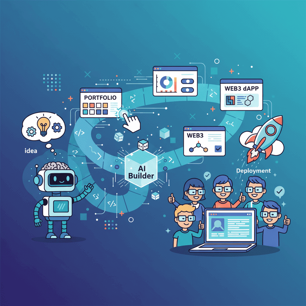
I've shipped 47 apps using AI in the last year.
Not prototypes. Not "proof of concepts" that live in a folder called "side-projects-2024." Real, production applications that people actually use—including three that now generate revenue.
Here's what I've learned: building apps with AI isn't about finding magic prompts. It's about understanding how to decompose problems, manage complexity, and ship incrementally.
Most tutorials show you how to generate a component. This guide shows you how to build a complete application—from the first prompt to deployment.
Key Takeaways:
- Building complete apps with AI requires a different mindset than generating individual components
- Start with project decomposition: break your app into buildable pieces before touching any AI tool
- Complexity scales non-linearly—master simple projects (portfolios, landing pages) before tackling dashboards and Web3 dApps
- The "build → review → refine" loop is your fundamental workflow
- Ship early, iterate fast—your first AI-generated version won't be perfect, and that's fine
Table of Contents
- The Build-with-AI Mindset
- Project Planning & Decomposition
- Beginner: Portfolio Website
- Beginner: Startup Landing Page
- Intermediate: SaaS Dashboard
- Intermediate: Admin Panel
- Intermediate: E-commerce UI
- Advanced: Web3 dApp
- From Prototype to Production
- Project Complexity Comparison
- Frequently Asked Questions
Try this prompt⌘+Enterto launch
The Build-with-AI Mindset
Let me start with the uncomfortable truth: most people fail at building apps with AI because they approach it like traditional development, just faster.

It's not just faster. It's fundamentally different.
In traditional development, you think in code. You architect data structures, plan functions, consider edge cases upfront. With AI-assisted building, you think in outcomes and iterations. You describe what you want, evaluate what you get, and refine until it's right.
This requires three mental shifts:
1. Embrace Imperfect First Versions
Your first AI-generated output will be 70-80% of what you want. Always. The magic happens in the iteration—not the initial generation.
I've watched people waste hours trying to craft the "perfect" prompt that generates exactly what they envision on the first try. That's not how this works. Generate something reasonable, then refine it. Five quick iterations beat one "perfect" prompt every time.
2. Think in Components, Build in Layers
A landing page isn't "a landing page." It's:
- A hero section
- A features grid
- A testimonials carousel
- A pricing table
- A footer
Generate each piece. Assemble them. Iterate on the whole. This modular approach gives you control and makes debugging drastically easier.
3. Know When to Write Code Yourself
AI is phenomenal at generating UI. It's decent at basic logic. It struggles with complex state management, data flows, and edge cases.
Know where the boundary is. Generate the visual layer with AI. Handle complex business logic yourself (or with AI assistance, but more carefully).
This diagram is your fundamental workflow. Internalize it.
Project Planning & Decomposition
Before you open any AI tool, you need a plan. Not a detailed technical spec—a clear breakdown of what you're building.
The Decomposition Framework
Every app I build starts with this exercise:
Step 1: Define the core user journey
What does the user need to do? Map it out in plain English:
- Land on homepage → understand value prop → sign up
- Log in → see dashboard → take primary action
- Browse products → add to cart → checkout
Step 2: Identify the screens/pages
From your user journey, list every distinct screen:
- Homepage
- Signup/Login
- Dashboard
- Product listing
- Product detail
- Checkout
- Confirmation
Step 3: Break each screen into components
This is where most people skip ahead too quickly. For a dashboard:
- Sidebar navigation
- Header with search
- Metrics cards (4x)
- Activity chart
- Data table
- Quick actions panel
Step 4: Prioritize by dependency
What needs to exist before other things can work?
Build foundation first, then core, then polish. Never start with polish.
Complexity Assessment
Not all projects are created equal. Here's how I assess complexity before starting:
| Factor | Low Complexity | Medium Complexity | High Complexity |
|---|---|---|---|
| Pages | 1-3 | 4-8 | 9+ |
| State Management | Static/simple | Some interactivity | Complex data flows |
| Forms | None or basic | Multi-step, validation | Dynamic, conditional logic |
| Data | Mock/static | API integration | Real-time, multiple sources |
| User Auth | None | Basic auth | Roles, permissions |
A portfolio website? Low complexity. A SaaS dashboard with real-time data? High complexity. Know what you're getting into.
Portfolio Website (Beginner)
Let's start with the simplest complete app: a developer portfolio. If you're new to building with AI, this is your training ground.
Why start here? Portfolios are essentially marketing pages. Static content, clear structure, room for creativity. Perfect for learning the AI-building workflow without getting tangled in complex logic.
Project Breakdown
| Section | Components | Complexity |
|---|---|---|
| Hero | Headline, subtitle, CTA, optional image | Simple |
| About | Bio text, photo, skill highlights | Simple |
| Projects | Grid/cards, images, descriptions, links | Medium |
| Skills | Icon grid or visual representation | Simple |
| Contact | Form and/or social links | Medium |
| Footer | Copyright, navigation, socials | Simple |
The Build Workflow
1. Start with the hero
The hero sets the tone for everything else. Get this right first.
2. Build the about section
This is where you inject personality. Don't be boring.
3. Generate the projects grid
Pro tip: Use real project names and descriptions in your prompts. "Project Alpha" creates generic output; "TaskFlow - a Kanban board that reduced team overhead by 40%" creates output that feels real.
4. Add skills and contact
These are straightforward. The contact form is your most complex component here—make sure to specify validation.
5. Assemble and polish
Connect the sections. Add smooth scroll navigation. Test on mobile.
Our comprehensive portfolio website guide has 20+ tested prompts for every section, including three complete portfolio styles you can generate in one shot.
Common Pitfalls
- Generic content: Replace all placeholder text with real content before deploying
- Forgetting mobile: Check your portfolio on actual devices, not just browser DevTools
- Too many projects: Curate ruthlessly. 4 strong projects beat 10 mediocre ones.
- No clear CTA: Make it obvious how someone should contact you
Startup Landing Page (Beginner)
Landing pages are marketing machines. Unlike portfolios (which showcase you), landing pages have one job: convert visitors into users/customers.
This changes how you approach the build.
The Conversion Framework
Every landing page needs these elements in roughly this order:
- Hook (hero) - Grab attention, state the value prop
- Problem - Agitate the pain point
- Solution - Introduce your product
- Proof - Testimonials, logos, stats
- Features - What they get
- Pricing (optional) - How much it costs
- FAQ - Overcome objections
- CTA - Final push to convert
Section-by-Section Build
Hero Section
Your hero has 3 seconds to convince someone to keep scrolling. Be specific, be bold, show the outcome.
Social Proof Section
Nothing sells like proof. Include:
- Customer testimonials with photos
- Logo bar of known companies
- Concrete numbers (users, revenue, time saved)
Features Section
Focus on benefits, not features. "AI-powered optimization" means nothing. "47% higher open rates without A/B testing" means everything.
Pricing Section
If you're including pricing, keep it simple. 3 tiers maximum. Highlight the recommended plan.
For the complete workflow with 30+ tested prompts, check out our startup landing page guide.
Conversion Optimization Tips
| Element | Best Practice |
|---|---|
| Headlines | Use numbers and specific outcomes |
| CTAs | Action verbs + benefit ("Start Saving Time") |
| Social Proof | Real names, real photos, specific results |
| Pricing | Anchor with highest tier, highlight middle |
| Forms | Minimize fields, show progress on multi-step |
SaaS Dashboard (Intermediate)
Now we're getting into more complex territory. Dashboards are where most AI-building projects stall—not because the AI can't generate good components, but because people don't plan the architecture properly.
Why Dashboards Are Harder
- Multiple interconnected components
- State that persists across sections
- User-specific data and permissions
- More edge cases (empty states, loading, errors)
- Responsive design is more complex (sidebars, tables)
Architecture First
Before generating anything, map your dashboard structure:
Build in this order:
- Layout shell (sidebar + header)
- Empty content area with routing
- Metrics cards
- Primary data table or view
- Secondary components (charts, feeds)
- Modals and overlays
- Empty/loading/error states
The Critical Components
1. Layout Shell
Get this right first. Everything else fits inside it.
2. Metrics Cards
These are your at-a-glance KPIs. Be specific about what metrics matter for your SaaS.
3. Data Tables
Tables are deceptively complex. Your prompt needs to specify:
- Columns and data types
- Sorting capability
- Filtering options
- Pagination
- Row actions (edit, delete, view)
- Empty and loading states
4. Charts
Always specify the charting library (Recharts is my go-to for React) and provide sample data. Without sample data, you'll get placeholder charts with weird proportions.
For the complete dashboard building workflow with comprehensive prompts for every component, see our SaaS dashboard guide.
State Management Considerations
Here's where AI-generated dashboards often fall short: managing data across components.
For simple dashboards, React's built-in state and prop drilling work fine. For anything complex:
- Consider Zustand or Jotai for lightweight state management
- Plan your data flow before generating components
- Generate each component to accept props, not manage its own data
Don't try to generate complex state management with AI. Generate the UI, then wire up the state yourself.
Try this prompt⌘+Enterto launch
Admin Panel (Intermediate)
Admin panels are dashboards with superpowers. They're not just about viewing data—they're about managing it.
What Makes Admin Different
| Dashboard | Admin Panel |
|---|---|
| View data | View + modify data |
| User's own data | All users' data |
| Read-heavy | Read + write heavy |
| Simple permissions | Role-based access |
| Clean, focused | Feature-dense |
Core Admin Components
Every admin panel needs:
1. User Management
2. Content/Data Management
This depends on your specific use case. Could be:
- Blog posts management
- Product inventory
- Order management
- Support tickets
3. Settings & Configuration
System-wide settings, integrations, billing, etc.
4. Activity Logs
For audit trails and debugging user issues.
For detailed prompts covering CRUD interfaces, role management, and admin-specific patterns, see our admin panel tutorial.
Security Considerations
Admin panels require extra attention to security:
- Always verify permissions server-side (never trust the frontend)
- Log sensitive actions
- Require re-authentication for destructive operations
- Implement session timeouts
- Add two-factor authentication for admin users
AI can generate the UI for these features, but implementing actual security requires careful backend work.
E-commerce UI (Intermediate)
E-commerce UIs are conversion machines. Every element exists to move users toward purchase.
The E-commerce Funnel
Every step should reduce friction. Every element should build trust.
Key Components
1. Product Grid/Listing
2. Product Detail Page
This is where purchase decisions happen. Include:
- High-quality image gallery (zoom on hover)
- Variant selection (size, color)
- Clear pricing and availability
- Add to cart with quantity selector
- Shipping information
- Return policy
- Reviews section
3. Shopping Cart
The cart needs to be accessible from anywhere (slide-out drawer works well) and frictionless.
4. Checkout Flow
Minimize steps. Show progress. Offer guest checkout. Display trust signals.
For complete e-commerce UI patterns including product cards, cart systems, and checkout flows, see our e-commerce UI prompts guide.
Trust Signals That Convert
| Signal | Placement | Impact |
|---|---|---|
| SSL badge | Footer, checkout | Required |
| Payment icons | Footer, checkout | High |
| Money-back guarantee | Product page, checkout | High |
| Customer reviews | Product page | Very High |
| "Secure checkout" text | Cart, checkout | Medium |
| Real customer photos | Throughout | High |
Web3 dApp (Advanced)
Web3 UIs are the final boss. They combine all the complexity of traditional web apps with blockchain-specific challenges: wallet management, transaction states, network switching, and user education.
Why Web3 Is Different
| Traditional Web App | Web3 dApp |
|---|---|
| Username/password auth | Wallet-based auth |
| Instant actions | Transaction confirmations |
| Server-managed state | Blockchain state |
| Simple error handling | Gas failures, reverts, network issues |
| One network | Multi-chain support |
The Web3 Component Stack
1. Wallet Connection (Most Critical)
This is your dApp's front door. Get it wrong, and users bounce.
2. Token/NFT Displays
Show users what they own with clear, scannable interfaces.
3. Transaction Interfaces
Swaps, staking, minting—whatever your dApp does, the transaction UI needs to handle:
- Input validation
- Balance checking
- Gas estimation
- Transaction submission
- Pending state (with explorer link)
- Confirmation
- Error handling
4. Transaction History
Users need to see what they've done and verify it worked.
For comprehensive Web3 UI patterns covering wallet connections, DeFi interfaces, NFT galleries, and more, see our Web3 dApp UI guide.
Web3 State Complexity
The hardest part of dApp development isn't the UI—it's managing all the states:
Your UI needs to gracefully handle every one of these states. Include them explicitly in your prompts.
From Prototype to Production
You've built your app with AI. It works in development. Now what?
The Production Checklist
1. Code Review and Cleanup
AI-generated code works, but it's not always clean. Before deploying:
- Remove unused imports and components
- Consolidate duplicate styles
- Check for hardcoded values that should be configs
- Ensure consistent naming conventions
- Add proper error boundaries
2. Performance Optimization
- Optimize images (compress, use proper formats)
- Lazy load below-the-fold components
- Minimize bundle size (check for heavy dependencies)
- Enable caching
- Test on slow connections
3. Accessibility Audit
AI often generates visually correct but accessibility-incomplete components:
- All images have alt text
- Form inputs have labels
- Color contrast meets WCAG standards
- Keyboard navigation works
- Screen reader testing
4. Security Review
- No sensitive data in frontend code
- API keys are environment variables
- Input validation on all forms
- No XSS vulnerabilities
- HTTPS enforced
5. Testing
- Test all major user flows
- Test on multiple browsers
- Test on mobile devices (real devices, not just emulators)
- Test error states (what happens when API fails?)
Deployment Options
| Platform | Best For | Complexity |
|---|---|---|
| Vercel | Next.js, static sites | Low |
| Netlify | Static sites, simple backends | Low |
| Railway | Full-stack apps | Medium |
| AWS Amplify | Complex apps with AWS services | Medium-High |
| Self-hosted | Maximum control | High |
For static sites and most frontends, Vercel or Netlify will get you deployed in minutes.
Post-Launch
Your app is live. Now:
- Monitor: Set up error tracking (Sentry) and analytics
- Iterate: Watch user behavior, identify friction points
- Ship improvements: Use the same AI workflow to rapidly fix issues
Project Complexity Comparison
Use this table to assess which project type matches your current skill level:
| Project | Complexity | Time to Build | Key Challenge | Learn This First |
|---|---|---|---|---|
| Portfolio | Beginner | 2-4 hours | Content & design | Basic prompting |
| Landing Page | Beginner | 3-6 hours | Conversion optimization | Section composition |
| SaaS Dashboard | Intermediate | 8-16 hours | Data visualization, state | Component architecture |
| Admin Panel | Intermediate | 10-20 hours | CRUD operations, permissions | Forms, tables |
| E-commerce | Intermediate | 12-24 hours | Cart state, checkout flow | Complex state management |
| Web3 dApp | Advanced | 20-40 hours | Wallet states, transactions | Web3 fundamentals |
Start with portfolio or landing page. Move to dashboard when you're comfortable. Tackle Web3 when you've mastered everything else.
Frequently Asked Questions
How long does it take to build an app with AI?
It depends entirely on complexity. A portfolio can be done in 2-4 hours. A SaaS dashboard might take 2-3 days of focused work. A Web3 dApp with complex features could be 1-2 weeks. The AI dramatically speeds up the UI layer, but you still need time for planning, integration, and polish.
Do I need to know how to code?
For simple projects (portfolios, landing pages), basic HTML/CSS knowledge is enough to make tweaks. For dashboards and complex apps, you'll want JavaScript/React skills for state management and integration work. AI generates the components, but you need to wire them together.
What's the best AI tool for building apps?
There's no single "best" tool—they all have strengths. Fardino and v0 excel at React/UI components. Cursor and Claude are great for code-level work. I typically use a combination: start with a UI-focused tool for components, then refine in an AI-assisted code editor.
How do I handle backend/database needs?
AI tools like Fardino focus on frontend. For backend, you have options: serverless functions (Vercel, Netlify), Firebase, Supabase, or traditional backend frameworks. Generate your frontend with AI, then connect it to your backend of choice.
What if the AI generates broken code?
It happens. Common fixes: check for missing imports, verify the specified libraries are installed, look for syntax errors in code blocks. Often, running the code through the AI again with the error message helps. Our debugging guide covers the most common issues and fixes.
Can I use AI-generated code for commercial projects?
Yes. The code you generate is yours to use however you want. Just be aware that some AI tools may have usage terms about the platforms themselves—read those if you're unsure.
How do I make AI-generated UIs unique?
The "sameness" problem is real. Solutions: provide very specific design direction (colors, typography, spacing), use reference screenshots, specify your brand guidelines, and always customize generated code rather than using it as-is. The more context you provide, the more unique your output.
Should I generate full pages or individual components?
Both, strategically. Start with full page prompts to get the structure, then refine individual components that need more attention. For complex apps, always generate the layout shell first, then populate it component by component.
Start Building
You've got the roadmap. You understand the mindset. You know how complexity scales.
Here's my challenge to you: build something this week.
Not a perfect something. Not a production-ready something. Just... something. A portfolio. A landing page for an idea you've been sitting on. A dashboard for tracking something you care about.
The skills you develop building one app transfer directly to the next. Your third AI-built app will be dramatically better than your first—not because the AI got smarter, but because you learned how to work with it effectively.
Pick a project. Open your AI tool of choice. Start with the hero section.
Ship it.
Related Guides
Project-Specific Tutorials
- Build Your Portfolio with AI: 20+ Prompts That Work
- Build a Startup Landing Page with AI
- Build a SaaS Dashboard with AI: Prompts That Actually Work
- Build an Admin Panel with AI: Prompts That Work
- AI E-commerce UI Prompts That Actually Sell
- Build Web3 dApp UI with AI: Prompts That Work
Foundational Skills
- Vibe Coding: The Complete Guide to AI-Powered Development
- AI UI Prompts: 300+ Templates That Actually Work
- Context Engineering for AI Coding
Workflow & Debugging
- Fix AI-Generated Code Errors (Actually Works)
- Vibe Debugging: 5-Step Workflow That Fixes Any AI UI
- Vibe Refactoring: 20+ Prompts to Clean Up AI Code
Written by the Fardino Team. We build AI tools for frontend developers. Build with Fardino →


