Back to Guides

Build Web3 dApp UI with AI: Prompts That Work

Web3 UX is brutal. I built 8 dApp interfaces with AI—most wallet connects looked like 2019. Here's what actually works.

Build Web3 dApp UI with AI: Prompts That Work - Featured Image

Here's a hot take that'll get me in trouble: Web3 has a UX problem, and it's embarrassing.

We've got billion-dollar protocols with interfaces that look like they were designed by someone who's never heard of a design system. Seed phrases written on napkins. Wallet popups that confuse even crypto natives. Meanwhile, Web2 apps are serving smooth, intuitive experiences that make our dApps look like relics.

But here's the thing—you can actually build Web3 dApp UIs with AI that don't make users want to throw their hardware wallets out the window. And honestly? It's faster than building traditional landing pages once you know the right prompts.

Key Takeaways:

  • Web3 UI prompts need specific blockchain context—generic prompts generate generic (broken) results
  • Wallet connection UIs are the make-or-break moment for dApp user retention
  • AI can generate production-ready DeFi interfaces, NFT galleries, and token dashboards in minutes
  • The secret sauce: describe the user state, not just the visual elements

In This Article

The Web3 UX Problem (And How AI Fixes It)

Let me be blunt: most dApp interfaces feel like they were built by backend engineers who drew the short straw. No shade—blockchain development is hard enough without worrying about hover states and responsive breakpoints.

In This Article

The result? Users bounce. According to recent data, over 70% of potential dApp users abandon onboarding at the wallet connection step. That's not a "crypto is complicated" problem. That's a design problem.

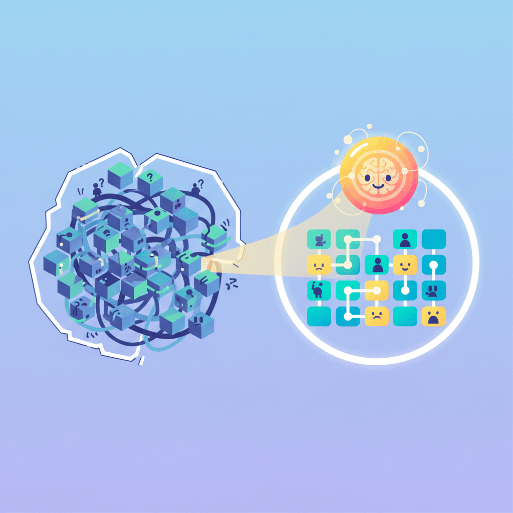
AI changes this equation completely.

Instead of hiring an expensive Web3-specialized designer or spending weeks learning DeFi UI patterns, you can describe what you want and get production-ready components in minutes. The catch? You need prompts that understand Web3 context.

Generic prompts like "create a dashboard" will give you generic results. But prompts that speak the language of Web3—wallet states, token balances, transaction pending states—generate UIs that actually work.

Understanding dApp UI Components

Before diving into prompts, let's map out what you actually need to build:

ComponentWhat It DoesComplexity
Wallet ConnectOnboarding, authenticationHigh (multiple states)
Token DashboardDisplay holdings, balancesMedium
NFT GalleryShow collectibles, metadataMedium
Swap InterfaceToken exchange UIHigh (validation, states)
Staking InterfaceLock tokens, show rewardsMedium-High
Token GatesAccess control UILow-Medium

The key insight here is that Web3 UIs have way more states than typical web apps. A button isn't just idle/hover/active—it's also "wallet not connected," "wrong network," "transaction pending," "transaction confirmed," and "transaction failed."

If your prompts don't account for these states, your AI-generated UI will look pretty but break in production.

Wallet Connection UI Prompts

This is where most dApps lose users. Get this wrong, and nothing else matters.

The Web3 UX Problem (And How AI Fixes It)

MetaMask-Style Connect Button

The classic approach. Clean, recognizable, works:

Create a wallet connection component with: - Primary "Connect Wallet" button with wallet icon - Dropdown showing MetaMask, WalletConnect, and Coinbase Wallet options - Connected state showing truncated address (0x1234...5678) with copy button - Disconnect dropdown on click - "Wrong Network" warning state with switch network button - Pending connection spinner state - Use Tailwind, dark theme, rounded corners - Show ETH balance next to address when connected

Want to try this yourself?

Try with 0xMinds →

Social Login Style (Web3Auth Pattern)

The "I don't want to deal with seed phrases" crowd is growing. Smart move to support them:

Build a modern Web3 login modal with: - Email input field at top - Divider with "or continue with" - Social buttons: Google, Twitter/X, Discord (horizontal row with icons) - "Connect Wallet" link at bottom for crypto-native users - Clean white modal, rounded-2xl, subtle shadow - Show loading state with spinner after selection - Success checkmark animation on connect - Works on mobile (bottom sheet style)

This pattern is huge for mainstream adoption. If you're building something that isn't just for crypto degens, this is the way.

Network-Aware Connection UI

Here's something most tutorials skip—handling multi-chain:

Create a chain-aware wallet connection component: - Connect button shows current network icon (ETH, Polygon, Arbitrum, Base) - Network selector dropdown when clicking the network icon - Visual indicator for supported vs unsupported chains - Auto-prompt to add network if not in wallet - Show gas estimate in current network's native token - Different accent colors per chain (blue for ETH, purple for Polygon, etc.) - Tailwind CSS, glass morphism style

Token Dashboard & Portfolio Prompts

Once they're connected, show them their bags. This is where users start to trust your dApp.

Portfolio Overview Card

Build a crypto portfolio card showing: - Total portfolio value in USD (large, bold) - 24h change with percentage and color (green up, red down) - Mini sparkline chart showing 7-day trend - Top 3 holdings as horizontal token icons with small labels - "View All" link to full portfolio - Skeleton loading state for when data is fetching - Dark card with subtle gradient border - Responsive: stacks nicely on mobile

Want to try this yourself?

Try with 0xMinds →

Token Balance List

Create a token balance list component: - Each row: token icon, name, symbol, balance, USD value - Sortable by balance or value (click column headers) - Search/filter input at top - "Hide small balances" toggle (under $1) - Expandable row showing token contract, add to wallet button - Empty state: "No tokens found" with illustration - Hover state highlights row with subtle background - Virtual scrolling hint: "scrollable" for long lists

Transaction History Feed

Build a transaction history component: - List of recent transactions (swap, send, receive, approve) - Each item shows: type icon, description, amount, time ago, status - Status indicators: pending (spinner), confirmed (checkmark), failed (x) - Click to expand shows: tx hash (link to explorer), gas used, block - Filter tabs: All, Swaps, Sends, Receives - Pull-to-refresh on mobile - "Load more" pagination at bottom - Empty state for no transactions

NFT displays are where you can actually have fun with AI generation. The visual nature makes them perfect for AI.

Create an NFT gallery grid: - Responsive grid: 4 columns on desktop, 2 on tablet, 1 on mobile - Each NFT card: square image, name below, collection name subtle - Hover effect: slight scale up, show "View" button overlay - Floor price badge in corner of image - Lazy loading with blur placeholder - Filter bar: collections dropdown, sort by (recent, price, rarity) - Infinite scroll with loading spinner at bottom - Dark theme, rounded-xl cards, subtle shadows

Want to try this yourself?

Try with 0xMinds →

NFT Detail Modal

Build an NFT detail modal: - Large image on left (or top on mobile) - Right side: NFT name, collection (linked), owner address (truncated) - Properties/traits grid with rarity percentages - Price section: current price, last sale, price history chart - Action buttons: Buy Now, Make Offer, Share - Provenance/history tab showing past sales - Description expandable text - Close button (X) and click-outside-to-close - Smooth fade-in animation

Collection Display

Create an NFT collection page header: - Banner image (full width, 200px height) - Collection avatar overlapping banner bottom - Collection name, verified badge, creator link - Stats row: items count, owners, floor price, volume - Description with "read more" truncation - Social links: Twitter, Discord, website - "Mint" or "View on OpenSea" primary CTA - Tabs below: Items, Activity, Analytics

DeFi Interface Prompts

DeFi UIs are where AI really shines—these interfaces are complex but follow established patterns.

Token Swap Interface (Uniswap-Style)

This is the bread and butter of DeFi:

Build a token swap interface: - "You Pay" input: token selector button, amount input, balance shown, MAX button - Swap direction button (rotating arrows icon) between inputs - "You Receive" input: same structure, shows estimated output - Exchange rate display between the two tokens - Slippage tolerance button (0.5%, 1%, custom) in corner - Price impact warning if > 2% (yellow) or > 5% (red) - "Swap" primary button - states: Connect Wallet, Enter Amount, Insufficient Balance, Swap - Transaction settings gear icon - Dark theme, card style, gradient accent on primary button

Want to try this yourself?

Try with 0xMinds →

Staking Interface

Create a staking interface card: - Token being staked: icon, name, your staked amount - APY display (large, prominent, with fire emoji optional) - Two tabs: Stake and Unstake - Amount input with balance and MAX button - Lock period selector (if applicable): 30d, 90d, 180d, 365d - Rewards preview: "You'll earn X tokens over Y days" - Pending rewards display with Claim button - Stake/Unstake primary action button - Recent staking transactions list below

Liquidity Pool Card

Build a liquidity pool position card: - Pool pair: two token icons overlapping, pair name (ETH/USDC) - Your position value in USD - Token amounts breakdown (X ETH + Y USDC) - Pool share percentage - Unclaimed fees amount with Collect button - In range / Out of range status (for concentrated liquidity) - Add Liquidity and Remove buttons - Mini price range visualization bar - Click to expand full position details

Token-Gated Content Prompts

Token gating is having a moment. Here's how to build the UI:

Access Control Gate

Create a token-gated content section: - Blurred content preview in background - Centered lock icon with message - "Hold X NFT to unlock" or "Hold X tokens to access" - Connect Wallet button if not connected - If connected but don't hold: show what's needed, where to get it - If holds token: smooth unlock animation, reveal content - Fallback: "Purchase access" option linking to marketplace - Clean minimal design, glass morphism card

Premium Member Badge

Build a membership status component: - User's NFT avatar/PFP - Membership tier badge (Bronze, Silver, Gold, Diamond) - Benefits list with checkmarks - "Upgrade" button if not top tier - Time remaining if subscription-based - Share membership status button - Small and embeddable in sidebar or profile

Web3 Landing Page Prompts

Your dApp's front door. Make it count.

dApp Hero Section

Create a Web3 dApp hero section: - Bold headline: "The Future of [DeFi/NFTs/Gaming]" style - Subheadline explaining the value prop in one sentence - Two CTAs: "Launch App" (primary), "Read Docs" (secondary) - Animated background: subtle floating shapes or gradient mesh - Stats bar: TVL, Users, Transactions - animated counting up - Supported chains icons row - Dark theme with accent color (purple/blue gradient) - Responsive: text stacks on mobile, CTAs full width

Want to try this yourself?

Try with 0xMinds →

For more hero section patterns, check out our guide on AI hero section prompts.

Protocol Features Section

Build a features grid for a DeFi protocol: - 3-column grid (stacks on mobile) - Each feature: icon, title, 2-line description - Features: Non-Custodial, Instant Swaps, Low Fees, Multi-Chain, Audited, Governance - Icons should be outline style, accent colored - Subtle hover animation on each card - Optional: small "Learn more" link per feature - Dark theme with subtle card backgrounds

If you're building out a full landing page, our landing page prompts guide covers all the other sections you'll need.

Common Web3 UI Mistakes and Fixes

After building way too many dApp interfaces, here's what trips people up:

Mistake 1: Ignoring Loading States

Web3 is slow. Blockchain confirmations take time. If your UI doesn't handle pending states, users think it's broken.

Fix: Always specify loading/pending states in your prompts. Add skeleton screens, spinners, and progress indicators.

Mistake 2: No Error States

Transactions fail. Networks get congested. Wallets disconnect.

Fix: Include error states explicitly: "Show error state with retry button when transaction fails."

Mistake 3: Desktop-Only Design

More than half of crypto users are on mobile. Seriously.

Fix: Always add "mobile responsive" to your prompts. Specify touch targets and bottom sheets for mobile.

Mistake 4: Confusing Wallet States

The wallet is connected, but to the wrong network. Or connected but with no balance. Or connected but needs approval.

Fix: Map out all possible wallet states and include them in prompts. Here's my checklist:

StateWhat to Show
Not connectedConnect Wallet button
ConnectingSpinner + "Connecting..."
Wrong networkWarning + Switch Network button
Connected, no balanceBalance: 0 + "Get tokens" link
Connected, readyGreen indicator + truncated address
Transaction pendingSpinner + "Pending..." + tx link
Transaction confirmedSuccess checkmark + View on Explorer
Transaction failedError message + Retry button

Mistake 5: Forgetting About Gas

Nobody likes surprise gas fees. Show them upfront.

Fix: Include gas estimation in your prompts: "Show estimated gas fee in USD below the action button."

For more on avoiding common pitfalls, see our vibe coding mistakes guide.

Complete dApp Frontend Prompt

Want to generate a whole dApp UI in one shot? Here's a comprehensive prompt that ties everything together:

Build a complete DeFi dApp interface with the following: LAYOUT: - Dark theme, gradient accents (purple to blue) - Sidebar navigation on desktop, bottom nav on mobile - Main content area with max-width 1200px, centered NAVBAR: - Logo on left - Navigation: Swap, Pool, Stake, NFTs - Wallet connect button on right (show connected state with address) - Network selector dropdown MAIN CONTENT (Swap page as default): - Token swap card centered - You Pay input with token selector, amount, balance, MAX - Swap direction button - You Receive input with estimated output - Exchange rate, slippage settings - Swap button with multiple states (connect, approve, swap) - Price impact warning if > 2% SIDEBAR: - Recent transactions list - Quick stats: gas price, block number - Help/docs link FOOTER: - Social links: Twitter, Discord, Telegram - Legal links: Terms, Privacy - "Audited by X" badge Make it responsive, include loading states, and use modern glass morphism styling.

This will give you a solid foundation. From there, iterate on specific sections using the targeted prompts above.

For building out the navigation and footer pieces specifically, check out our navbar and footer prompts guide.

You Might Also Like

Frequently Asked Questions

How do I build a dApp UI with AI?

Start with wallet connection—it's the most critical component. Use prompts that specify all wallet states (disconnected, connecting, wrong network, connected). Then layer on token displays, transaction interfaces, and any specialized features. The key is including Web3-specific context like blockchain states, transaction pending indicators, and multi-chain support in your prompts.

What prompts work best for Web3 interfaces?

The best Web3 UI prompts are specific about states, not just visuals. Instead of "create a button," say "create a wallet connect button with disconnected, connecting, wrong network, and connected states." Include details like truncated addresses, network indicators, and gas estimates. Generic prompts give generic results.

Can I vibe code a complete Web3 app?

Absolutely. AI can generate production-ready wallet connects, token dashboards, swap interfaces, NFT galleries, and more. The frontend is totally doable. You'll still need to integrate with actual blockchain SDKs (ethers.js, wagmi, thirdweb) on the logic side, but the UI layer? AI handles that beautifully.

What's the hardest part of dApp UI to generate with AI?

Transaction state management. A swap button needs like 8 different states: connect wallet, select token, enter amount, insufficient balance, approve token, approving, swap, swapping, and confirmed. If you don't specify these in your prompt, you'll get a button that only works in the happy path. Always map out states before prompting.

How do I make Web3 UI mobile-friendly?

Add "mobile responsive" to every prompt, but be specific. Say things like: "bottom sheet modal on mobile," "touch-friendly token selector," "full-width buttons on small screens." Also, mobile users often have slower connections, so include skeleton loading states. Over 50% of crypto users are on mobile—ignore them at your own risk.


Written by the 0xMinds Team. We build AI tools for frontend developers. Try 0xMinds free →

<!-- SCHEMA_DATA { "article": { "@type": "Article", "headline": "Build Web3 dApp UI with AI: Prompts That Work", "description": "Web3 UX is brutal. I built 8 dApp interfaces with AI—most wallet connects looked like 2019. Here's what actually works.", "author": { "@type": "Organization", "name": "0xMinds", "url": "https://0xminds.com" }, "datePublished": "2025-12-18", "dateModified": "2025-12-18" }, "faq": [ { "question": "How do I build a dApp UI with AI?", "answer": "Start with wallet connection—it's the most critical component. Use prompts that specify all wallet states (disconnected, connecting, wrong network, connected). Then layer on token displays, transaction interfaces, and any specialized features. The key is including Web3-specific context like blockchain states, transaction pending indicators, and multi-chain support in your prompts." }, { "question": "What prompts work best for Web3 interfaces?", "answer": "The best Web3 UI prompts are specific about states, not just visuals. Instead of 'create a button,' say 'create a wallet connect button with disconnected, connecting, wrong network, and connected states.' Include details like truncated addresses, network indicators, and gas estimates." }, { "question": "Can I vibe code a complete Web3 app?", "answer": "Absolutely. AI can generate production-ready wallet connects, token dashboards, swap interfaces, NFT galleries, and more. The frontend is totally doable. You'll still need to integrate with actual blockchain SDKs (ethers.js, wagmi, thirdweb) on the logic side, but the UI layer? AI handles that beautifully." }, { "question": "What's the hardest part of dApp UI to generate with AI?", "answer": "Transaction state management. A swap button needs like 8 different states: connect wallet, select token, enter amount, insufficient balance, approve token, approving, swap, swapping, and confirmed. If you don't specify these in your prompt, you'll get a button that only works in the happy path." }, { "question": "How do I make Web3 UI mobile-friendly?", "answer": "Add 'mobile responsive' to every prompt, but be specific. Say things like: 'bottom sheet modal on mobile,' 'touch-friendly token selector,' 'full-width buttons on small screens.' Over 50% of crypto users are on mobile—ignore them at your own risk." } ], "howto": { "name": "How to Build Web3 dApp UI with AI", "steps": [ {"name": "Start with wallet connection", "text": "Build the wallet connect component first with all states: disconnected, connecting, wrong network, and connected. This is your dApp's front door."}, {"name": "Add token displays", "text": "Create portfolio cards, token balance lists, and transaction history components. Always include loading and empty states."}, {"name": "Build specialized interfaces", "text": "Add swap interfaces, staking cards, NFT galleries, or other features specific to your dApp. Specify all transaction states in prompts."}, {"name": "Create landing and marketing pages", "text": "Build hero sections, feature grids, and token-gated content using Web3-specific prompts."}, {"name": "Test across wallet states and networks", "text": "Verify your UI handles wrong networks, failed transactions, and mobile users properly."} ] }, "breadcrumb": ["Home", "Blog", "Tutorials", "Build Web3 dApp UI with AI"] } SCHEMA_DATA -->
Share this article