AI Design System Prompts That Actually Scale
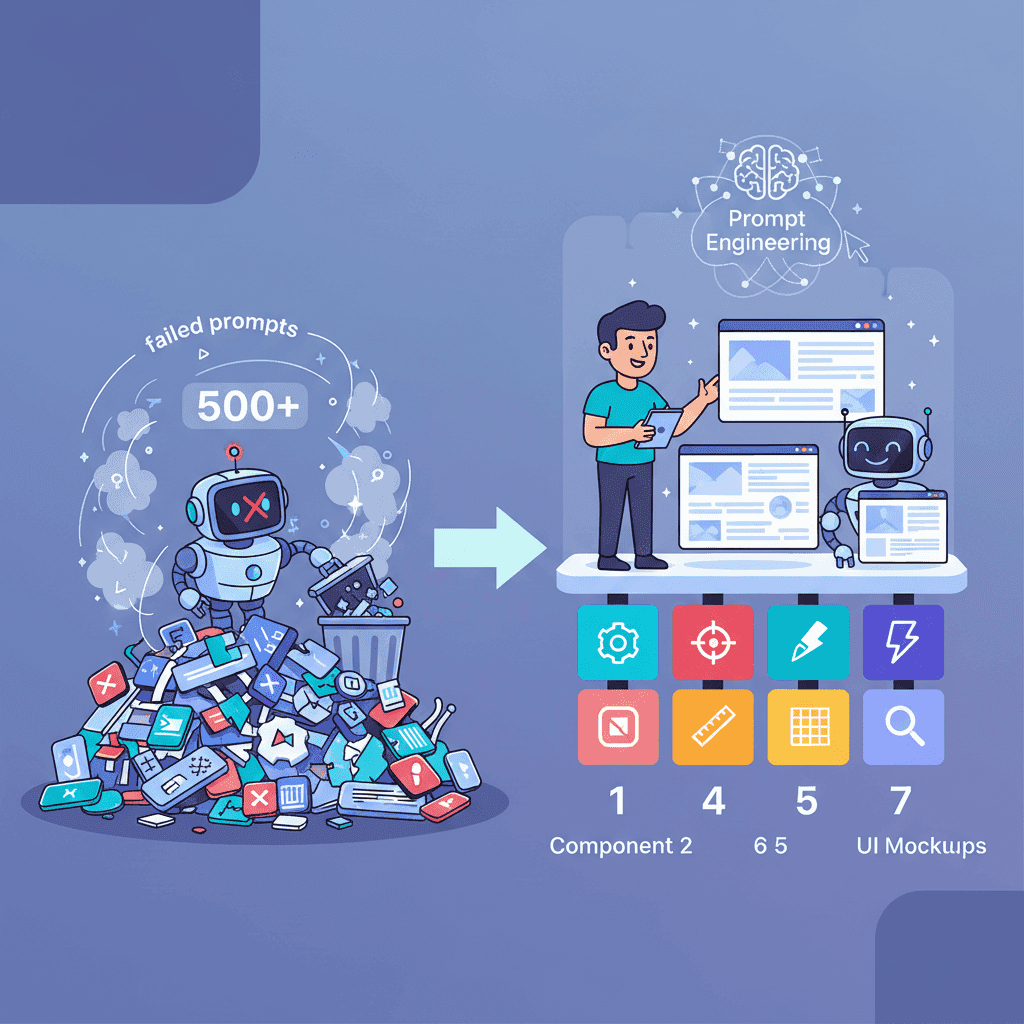
So you want to build a design system with AI. Cool. Let me save you the two weeks of pain I went through figuring out why every component looked slightly off after the first few prompts. Here's the thing nobody

So you want to build a design system with AI. Cool. Let me save you the two weeks of pain I went through figuring out why every component looked slightly off after the first few prompts.
Here's the thing nobody tells you: AI is great at generating individual components. It's terrible at maintaining consistency across them—unless you give it a system to follow. That system? Design tokens.
Key Takeaways:
- Design tokens are the foundation—without them, your AI-generated UI becomes inconsistent chaos by component #5
- Color prompts need specific format outputs (HSL or CSS variables) to work across components
- Typography scales should follow established ratios (1.25, 1.333, or 1.414) for mathematical harmony
- Always generate your token system FIRST, then reference it in every subsequent prompt
In This Article
- Why Design Tokens Change Everything
- AI Color Palette Prompts That Work
- Typography Scale Prompts
- Spacing System Prompts
- Border Radius & Shadows
- The Complete Design System Prompt
- Common Mistakes
- FAQ
Why Design Tokens Change Everything
I used to prompt AI like this: "Create a button with a nice blue color and good spacing."
The result? A blue button. Then I'd ask for a card component. Different blue. Different spacing. By the fifth component, my UI looked like a patchwork quilt made by someone who couldn't agree with themselves.
Design tokens fix this. They're the single source of truth—a set of variables that define your colors, typography, spacing, and effects. When you give AI these tokens upfront, every component it generates pulls from the same palette.
Here's the workflow that actually works:
The key insight? Treat tokens like a contract. The AI promises to use only what you've defined. This is the difference between vibe coding that works and vibe coding that falls apart.
If you're new to AI-assisted development, start with the vibe coding fundamentals guide to understand the bigger picture.
AI Color Palette Prompts That Work
Let's start with colors—the most visible part of any design system. I've tested dozens of color prompts. Most generate either (a) colors that clash horribly, or (b) palettes that look good on paper but don't provide enough contrast for actual UI work.
The Basic Color System Prompt
This is my go-to prompt for generating a primary color palette:
Want to try this yourself?
Semantic Color Tokens
Here's where most tutorials stop. But you need more than just brand colors—you need semantic tokens that tell AI what a color is for:
Why does this matter? Because now when you prompt "Create a card component using my design tokens," the AI knows exactly which token to use for borders vs. backgrounds vs. text.
The Full Color System Prompt
For a complete system, you'll also need success, warning, and error states. Here's the prompt I use:
This prompt generates everything you need for dark mode implementation later—you'll just need to create the inverted mappings.
Typography Scale Prompts That Don't Suck
Typography is where AI often goes off the rails. Ask for "good typography" and you'll get random font sizes with no relationship to each other. Ask for a scale and everything changes.
The Mathematical Scale Approach
Typography scales work because they follow mathematical ratios. The most common:
| Scale Name | Ratio | Best For |
|---|---|---|
| Minor Third | 1.2 | Dense UI, apps |
| Major Third | 1.25 | Most web apps |
| Perfect Fourth | 1.333 | Content-heavy sites |
| Augmented Fourth | 1.414 | Bold, dramatic designs |
| Golden Ratio | 1.618 | Editorial, marketing |
Here's my standard typography prompt:
Font Pairing Prompts
Getting the scale right is half the battle. The other half? Font pairing. This prompt has saved me hours:
The key detail here? Always specify the context. "Professional SaaS dashboard" gives wildly different results than "creative agency portfolio."
Spacing System Prompts: The Foundation Nobody Builds
I'm going to be honest—spacing is the most underrated part of design systems. Get it wrong and everything feels slightly off, even if you can't pinpoint why.
The 4px/8px Base System
Most modern design systems use a 4px or 8px base unit. Here's the prompt:
The semantic tokens at the bottom? That's the secret sauce. Instead of remembering "buttons use space-4 for horizontal padding," you just use --spacing-button-x.
This approach works beautifully with Tailwind component generation since Tailwind's default spacing scale uses the same 4px base.
Border Radius and Shadow Prompts
Shadows and border radius are the finishing touches that make UI feel polished—or cheap. Here's how to get them right:
Border Radius Scale
Shadow System
Shadows are trickier. You need multiple elevations that work together:
Putting It Together: The Complete Design System Prompt
Now here's where it gets interesting. Instead of running five separate prompts, you can generate your entire token system at once. This is the mega-prompt I use for new projects:
This single prompt gives you a production-ready token system. Save the output and reference it in every subsequent prompt with: "Use the design token system I provided."
Common Mistakes That Break Design Systems
After building dozens of these, I've seen the same mistakes over and over:
Mistake #1: Not saving your tokens Generate tokens once, save them, and paste them into every prompt. Don't regenerate—you'll get different values.
Mistake #2: Using arbitrary values
If AI suggests padding: 18px, push back. Stick to your scale. Consistency beats perfection.
Mistake #3: Forgetting dark mode from the start
Design your semantic tokens with dark mode in mind. --color-surface should map to white in light mode and a dark gray in dark mode—but that mapping should be obvious from day one.
Mistake #4: Over-engineering You don't need 20 grays. You need 5-7 that cover your use cases. Start minimal and expand only when you hit a real limitation.
Mistake #5: Skipping the semantic layer
Raw tokens (--blue-500) are building blocks. Semantic tokens (--color-interactive) are the API your components use. Always create both layers.
For more on avoiding AI coding pitfalls, check out 10 vibe coding mistakes to avoid.
Your Design System, Your Rules
Here's my hot take: design systems built for AI are different from traditional design systems. They need to be explicit, constrained, and contract-like.
When a human designer sees your Figma file, they interpret context and make judgment calls. AI doesn't have that luxury. It needs every decision pre-made and documented in your tokens.
The prompts in this guide give you that foundation. Use them, customize them, and watch your AI-generated UIs suddenly start looking... coherent.
Start with colors. Add typography. Layer in spacing. Before you know it, you'll have a system that scales—not just in design quality, but in development speed.
That's the real promise of AI-powered UI development: not just faster components, but components that actually work together.
You Might Also Like
- AI Dark Mode Prompts That Actually Work - Take your design tokens and implement seamless theme switching
- Generate Tailwind Components with AI - The workflow for turning tokens into Tailwind utility classes
- AI Landing Page Prompts Ultimate Guide - Put your new design system to work on complete pages
Frequently Asked Questions
What are design tokens?
Design tokens are named variables that store design decisions like colors, typography, and spacing. Instead of using #3B82F6 throughout your code, you use --color-primary-500. This makes your design system maintainable, scalable, and—critically for AI development—consistent across every generated component.
Can AI generate a complete design system from scratch?
Yes, but with guidance. AI won't magically understand your brand or make cohesive design decisions without constraints. The prompts in this guide provide that structure. Give AI specific requirements (ratios, scales, semantic mappings) and it will generate professional-grade token systems.
How do I maintain consistency after generating tokens?
Save your tokens as a CSS file or JSON and include them in every prompt. Start each AI interaction with "Reference these design tokens for all colors, spacing, and typography" followed by your saved tokens. This creates a contract the AI will follow.
Should I use CSS custom properties or JavaScript tokens?
For most web projects, CSS custom properties work great—they're native, performant, and supported everywhere. If you're building component libraries or need design tokens in JavaScript (for animations, conditional styling), consider generating both formats using tools like Style Dictionary.
What's the minimum viable design system for a new project?
Start with: (1) 10-shade primary color palette, (2) neutral/gray scale, (3) typography scale with 5-7 sizes, (4) spacing scale from 4px to 64px, and (5) 3-4 border radius values. You can add shadows, more colors, and semantic tokens as your project grows.
Written by the Fardino Team. We build AI tools for frontend developers. Build with Fardino →
Got an idea? Build it now.
Describe the site or app you want — Fardino turns it into a live website.