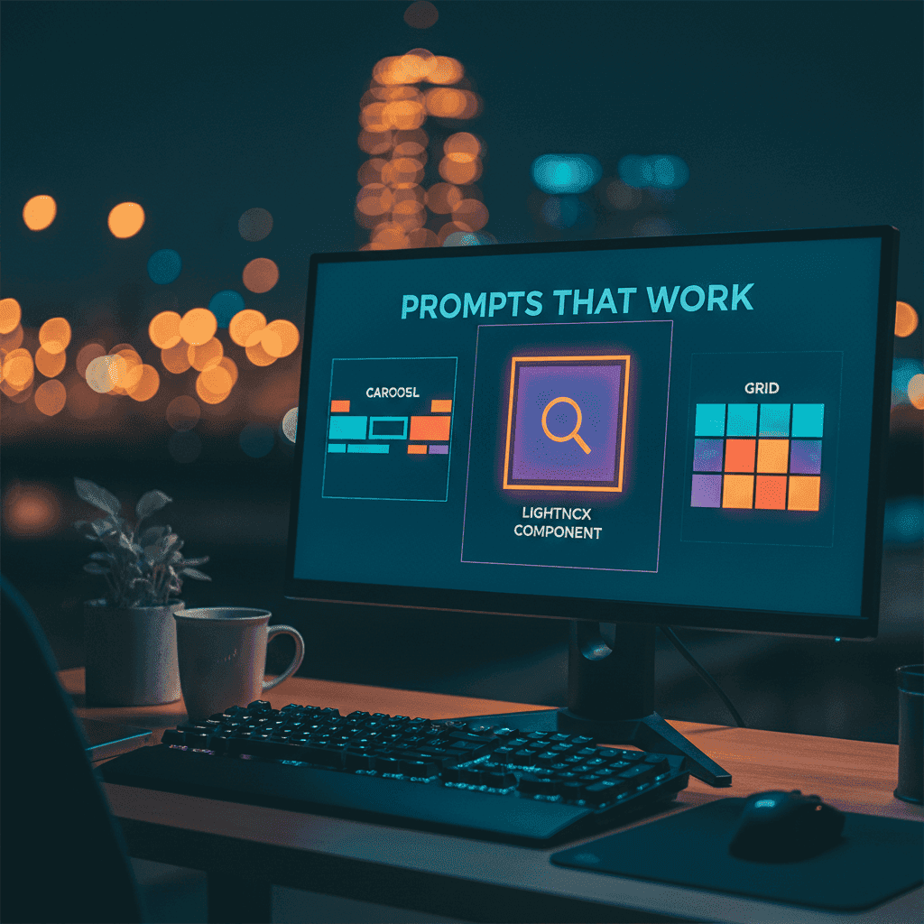
Liquid Glass UI Prompts: 20+ Templates That Work
Apple dropped liquid glass with iOS 26, and suddenly every designer on Twitter wants translucent everything. Fair enough — it looks gorgeous. But if you've tried generating liquid glass UI prompts with AI, you already know the pain: muddy backgrounds,

Apple dropped liquid glass with iOS 26, and suddenly every designer on Twitter wants translucent everything. Fair enough — it looks gorgeous. But if you've tried generating liquid glass UI prompts with AI, you already know the pain: muddy backgrounds, invisible text, borders that look like they were drawn in MS Paint.
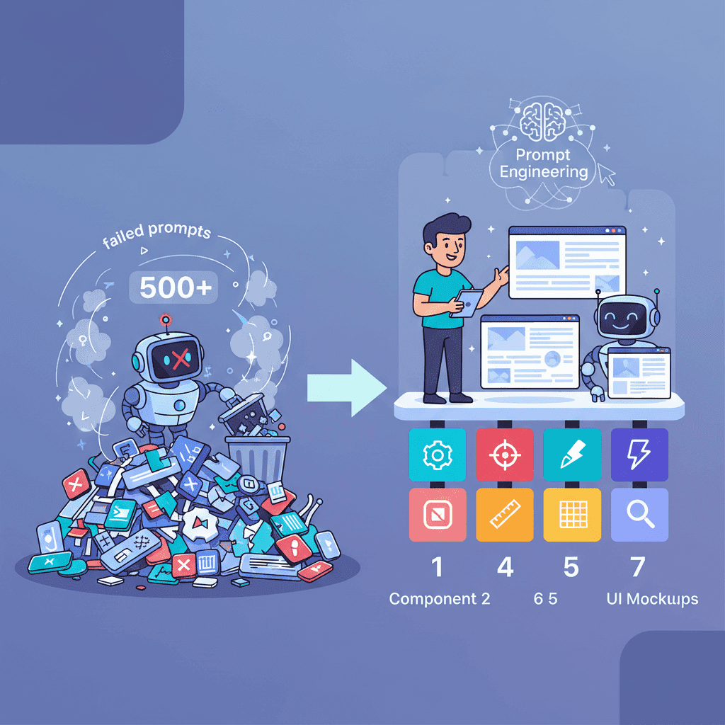
I spent two weeks testing liquid glass prompts across different AI tools. Most produced what I'd generously call "frosted garbage." But a handful? They nailed it. Here are the 20+ liquid glass UI prompts that actually generate clean, Apple-style glassmorphism components using Tailwind CSS.
Key Takeaways:
- Liquid glass effects rely on just 4 CSS properties — get those right in your prompt and the AI won't mess it up
- Most bad glass results come from missing contrast instructions — always specify text readability
- These prompts work with any AI UI builder that outputs Tailwind CSS and React
In This Article
- The 4 Properties That Make or Break Glass
- Card Prompts
- Navigation Prompts
- Hero Section Prompts
- Modal & Popup Prompts
- Button & CTA Prompts
- Dark Mode Glass
- Performance Tips
- Full Page Template
- FAQ
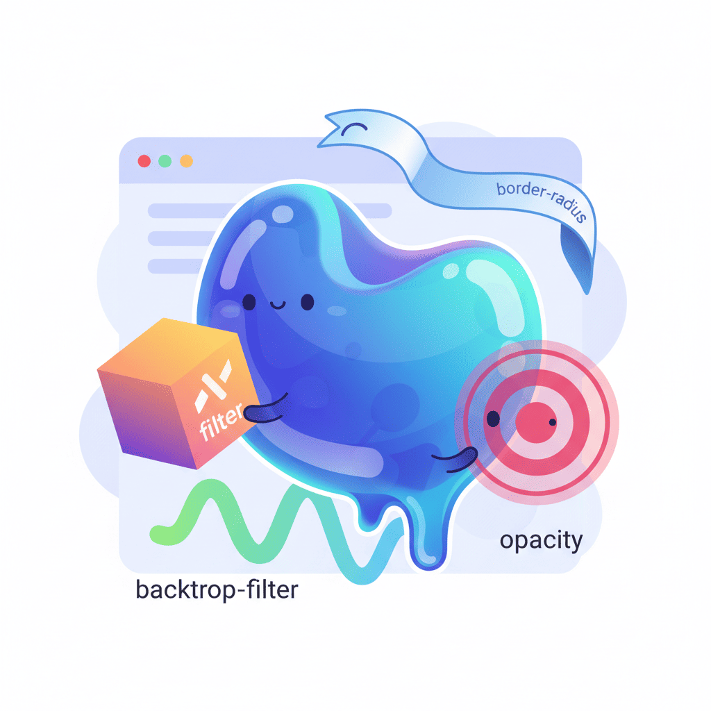
The 4 CSS Properties That Make Liquid Glass Work
Here's the thing nobody tells you: liquid glass isn't magic. It's four CSS properties working together. Miss one and the whole effect falls apart. Miss two and your AI will generate something that looks like a smudged window.

| CSS Property | Tailwind Class | What It Does | Skip It And... |
|---|---|---|---|
backdrop-filter: blur() | backdrop-blur-xl | Blurs content behind the element | No glass effect at all |
background: rgba() | bg-white/10 | Semi-transparent background tint | Blur is invisible |
border | border border-white/20 | Subtle edge definition | Looks like a floating blob |
box-shadow | shadow-lg | Depth and lift | Flat, lifeless result |
When you include all four in your prompt, AI tools suddenly get it right. When you leave them vague ("make it look glassy"), you get trash. This is the hill I'll die on: specific CSS instructions beat aesthetic adjectives every time when prompting for visual effects.
The key Tailwind combo to memorize:
backdrop-blur-xl bg-white/10 border border-white/20 rounded-2xl shadow-lg
That's your base. Every prompt below builds on this foundation.
Liquid Glass Card Prompts
Cards are where liquid glass shines brightest. Here are five prompts that consistently generate clean results.
Prompt 1: Basic Glass Card
Build a card component with a liquid glass effect using Tailwind CSS. Use backdrop-blur-xl, bg-white/10, border border-white/20, rounded-2xl, and shadow-lg. Include a title, description text, and a subtle tag. Text must be white and clearly readable. Place the card over a gradient background of purple to blue so the glass effect is visible.
Want to try this yourself?
Prompt 2: Glass Profile Card
Create a user profile card with liquid glass styling. Circular avatar at the top, name, role, and 3 stat counters (followers, projects, rating). Use backdrop-blur-2xl, bg-white/5 background, border border-white/10. Add a subtle inner glow using ring-1 ring-white/10. All on a dark mesh gradient background. Tailwind CSS only.
Prompt 3: Glass Pricing Card
Generate a pricing card with liquid glass effect. Include plan name, price with billing cycle, 5 feature bullet points with checkmarks, and a CTA button. The button should also be glass-styled with bg-white/20 and backdrop-blur-sm. Use border-white/15 for the card border. Highlight the "popular" plan with a slightly brighter bg-white/15. Tailwind CSS, React component.
Prompt 4: Glass Feature Card Grid
Build a 3-column feature card grid. Each card uses liquid glass: backdrop-blur-xl, bg-white/8, border border-white/15, rounded-xl. Each card has an icon (use emoji), title, and 2-line description. Cards should have a hover effect that increases bg to bg-white/15 and adds a slight scale transform. Background: dark gradient. Tailwind CSS.
Prompt 5: Glass Testimonial Card
Create a testimonial card with liquid glass styling. Include a quote icon, testimonial text in italic, user avatar, name, and company. Use backdrop-blur-lg, bg-white/10, border-white/20. Add a subtle gradient border effect using a wrapper div with gradient background and p-[1px]. Tailwind CSS and React.
If you're looking for more card variations beyond the glass style, check out our complete prompt templates collection — it covers every component type.
Glass Navigation: Navbar & Sidebar Prompts
A glass navbar is probably the first thing anyone tries when they discover this trend. And it's the first thing that goes wrong. The issue? Scroll behavior. Your glass navbar needs to look good both at the top of the page (over hero content) AND after scrolling (over other sections).
Prompt 6: Sticky Glass Navbar
Build a sticky navigation bar with liquid glass effect. Use backdrop-blur-xl, bg-white/10, border-b border-white/10. Include logo on the left, 4 navigation links centered, and a CTA button on the right. The navbar should be fixed at top with z-50. On scroll, subtly increase the background opacity to bg-white/15 using a scroll event listener. Tailwind CSS, React with useState.
Prompt 7: Glass Mobile Menu
Create a responsive glass navigation. Desktop: horizontal navbar with glass effect. Mobile: hamburger icon that opens a full-screen overlay with backdrop-blur-2xl, bg-black/40. Mobile menu items should be large, centered, and animate in with staggered fade-up. Include smooth transition between open/close states. Tailwind CSS, React.
Prompt 8: Glass Sidebar
Build a collapsible sidebar with liquid glass effect for a dashboard. Width 280px expanded, 80px collapsed. Use backdrop-blur-xl, bg-white/5, border-r border-white/10. Include navigation items with icons and text labels. Active item should have bg-white/10 highlight. Add a collapse toggle button. Dark background. Tailwind CSS, React.
Prompt 9: Glass Tab Navigation
Create a tab navigation component with glass styling. 4 tabs in a horizontal row. Each tab has an icon and label. Active tab gets bg-white/15 with backdrop-blur-sm and a bottom border glow. Inactive tabs are transparent. Smooth transition between tabs. Content area below should also be glass-styled. Tailwind CSS, React.
For more navigation patterns, we've got 40+ navbar and footer prompts that cover every layout you'd need.
Glass Hero Sections That Actually Convert
Here's where liquid glass goes from "cool effect" to "actual business value." A glass overlay on a hero section creates depth that flat designs can't match. The trick is contrast — your headline needs to punch through the blur.
Prompt 10: Glass Hero with CTA
Build a hero section with a full-width gradient background (dark purple to blue). Overlay a centered liquid glass container using backdrop-blur-xl, bg-white/10, border border-white/20, rounded-3xl, p-12. Inside: large headline (text-5xl font-bold text-white), subtitle paragraph, and two CTA buttons — one solid white, one glass-styled with bg-white/20 and backdrop-blur-sm. Tailwind CSS, React.
Want to try this yourself?
Prompt 11: Glass Hero with Stats Bar
Create a hero section: dark mesh gradient background with animated blobs. Main heading and subheading centered. Below the CTA buttons, add a glass stats bar — a horizontal strip with backdrop-blur-xl, bg-white/5, border-white/10, containing 4 key metrics (e.g., "10K+ Users", "99.9% Uptime") separated by vertical dividers. Tailwind CSS.
Prompt 12: Split Hero with Glass Card
Build a split hero section. Left side: headline text, paragraph, CTA button on a dark background. Right side: a liquid glass card floating over a colorful gradient with abstract shapes. The glass card contains a mini dashboard preview (mock chart and stats). Use backdrop-blur-2xl for the card. Add subtle float animation. Tailwind CSS, React.
We cover 25+ hero section patterns if you want options beyond glass effects.
Glass Modals & Popups: Frosted Dialog Prompts
Glass modals are gorgeous when done right and an accessibility nightmare when done wrong. The number one mistake: forgetting to specify that the backdrop overlay needs to be dark enough for the glass content to be readable.
Prompt 13: Glass Confirmation Modal
Create a centered confirmation modal with liquid glass effect. Dark backdrop overlay with bg-black/60 and backdrop-blur-sm. Modal container: backdrop-blur-2xl, bg-white/10, border border-white/20, rounded-2xl. Include a warning icon, title, description text, and two buttons — "Cancel" (ghost style) and "Confirm" (glass with red tint bg-red-500/20). Animate in with scale and fade. Tailwind CSS, React.
Prompt 14: Glass Notification Popup
Build a notification popup in the top-right corner with glass styling. Use backdrop-blur-xl, bg-white/10, border border-white/20. Include a close button, notification icon, title, message text, and a timestamp. Add slide-in animation from the right. Auto-dismiss after 5 seconds with a progress bar at the bottom. Tailwind CSS, React.
Prompt 15: Glass Command Palette
Create a command palette (Cmd+K) with glass effect. Full viewport dark overlay with backdrop-blur-sm. Centered glass container with search input at top, divider, and a scrollable list of command items grouped by category. Each item has an icon, name, and keyboard shortcut. Use backdrop-blur-2xl, bg-gray-900/80, border border-white/10. Active item highlighted with bg-white/10. Tailwind CSS, React.
For more modal and dialog patterns, check our 30+ modal prompt templates.
Glass Buttons & CTAs: Glossy Interactive Effects
Buttons are where subtle matters most. Go too heavy on the glass and your CTA disappears into the background. Go too light and it doesn't look like a button.
Prompt 16: Glass CTA Button Set
Create a set of 4 glass-styled buttons: Primary (bg-white/20, backdrop-blur-sm, border border-white/30, hover:bg-white/30), Secondary (bg-white/10, border-white/20), Ghost (transparent, border-white/15, hover:bg-white/10), and Icon button (circular, bg-white/15). All should have smooth transitions, rounded-xl, and a subtle shadow. Show them on a dark gradient background. Tailwind CSS.
Prompt 17: Glass Floating Action Button
Build a floating action button (FAB) in the bottom-right corner with glass effect. Circular button with backdrop-blur-xl, bg-white/15, border border-white/20, shadow-xl. Plus icon inside. On click, expand to reveal 3 smaller glass action buttons stacked vertically with staggered animation. Tailwind CSS, React.
Prompt 18: Glass Toggle / Switch
Create a toggle switch with liquid glass styling. Track uses bg-white/10 with border border-white/20. Active state: track becomes bg-blue-500/30 with border-blue-400/30. The knob should be glass-styled with backdrop-blur-sm, bg-white/40. Smooth spring-like transition. Include a label. Tailwind CSS, React.
Dark Mode Glass: Making It Work Both Ways
Most liquid glass tutorials only show dark backgrounds. And honestly? That's because glass on light backgrounds is hard. Really hard. The blur effect that looks stunning on dark becomes invisible on light. Here's how to make it work for dark mode and light mode.
Prompt 19: Dual-Mode Glass Card
Build a card component with liquid glass effect that works in both dark and light modes. Dark mode: backdrop-blur-xl, bg-white/10, border-white/20, text-white. Light mode: backdrop-blur-xl, bg-black/5, border-black/10, text-gray-900, shadow-xl. Use Tailwind's dark: prefix for all glass properties. Include a theme toggle button. Show the card on appropriate backgrounds for each mode. React with dark mode state.
Prompt 20: Adaptive Glass Navbar
Create a navigation bar with glass effect that adapts to light and dark mode. Dark: bg-white/10, border-white/10, text-white. Light: bg-white/70, border-gray-200/50, text-gray-900 with stronger shadow-lg. Use Tailwind dark: classes. Include a dark/light mode toggle in the nav. Smooth transition between modes. React component with theme context.
Performance: When Glass Gets Too Heavy
Real talk: backdrop-filter is expensive. Every glass element on your page forces the browser to re-render the content behind it on every frame. Stack five or six glass components and you'll feel it, especially on mobile.
Here's what works:
- Limit glass elements per viewport — 2-3 visible glass components at once is the sweet spot
- Use
will-change: transformon glass elements to hint the browser to create a separate layer (will-change-transformin Tailwind) - Avoid glass on scrolling lists — each item with
backdrop-blurduring scroll will tank performance - Reduce blur radius on mobile — swap
backdrop-blur-xlforbackdrop-blur-mdusing responsive classes:backdrop-blur-md lg:backdrop-blur-xl - Test on real devices — Chrome DevTools' mobile simulator doesn't show the actual performance hit
| Glass Elements per Page | Performance Impact | Recommendation |
|---|---|---|
| 1-3 | Negligible | Go for it |
| 4-6 | Noticeable on low-end devices | Test carefully |
| 7+ | Significant jank | Reduce or simplify |
If you're building Tailwind components with AI regularly, our Tailwind workflow guide covers optimization techniques that pair well with glass effects.
Full Page Template: Liquid Glass Landing Page
Time to put it all together. This prompt generates a complete landing page with the liquid glass aesthetic:
Prompt 21: Complete Liquid Glass Landing Page
Build a full landing page with liquid glass design language. Background: dark gradient (slate-950 to purple-950) with 3 animated gradient blobs (large blurred circles that slowly move). Sections: (1) Glass navbar — sticky, backdrop-blur-xl, bg-white/5, logo + 4 links + CTA button. (2) Hero — centered glass container with headline, subtitle, two CTA buttons, and a glass stats bar showing 4 metrics. (3) Features — 3-column grid of glass cards with icons, titles, descriptions. (4) Testimonials — glass cards with quotes and avatars. (5) CTA section — large glass container with headline and email signup form. (6) Footer — glass-styled with links and copyright. All glass elements use backdrop-blur-xl, bg-white/10, border-white/20, rounded-2xl. Ensure text contrast is readable throughout. Tailwind CSS, React. Make it responsive.
Want to try this yourself?
You Might Also Like
- AI Hero Section Prompts That Convert (25+ Templates) — More hero patterns to combine with glass effects
- AI Dark Mode Prompts That Actually Work — Deep dive into theme systems for glass components
- Generate Tailwind Components with AI (Stop Guessing) — The workflow behind consistently good AI output
Frequently Asked Questions
What is liquid glass UI design?
Liquid glass is Apple's design language introduced with iOS 26 in 2026. It uses translucent, frosted glass effects with blur, semi-transparent backgrounds, and subtle borders to create depth. It's essentially an evolution of glassmorphism with smoother, more refined aesthetics.
How do I create liquid glass effects with AI?
Include four specific CSS properties in your prompt: backdrop-filter: blur(), a semi-transparent background, a subtle border, and a box shadow. In Tailwind, that's backdrop-blur-xl bg-white/10 border border-white/20 shadow-lg. Being explicit about these classes gives AI tools much better results than vague descriptions like "make it glassy."
Can AI generate liquid glass components in Tailwind CSS?
Yes — and it does it well when you give specific instructions. The prompts in this guide use exact Tailwind utility classes so AI tools know precisely what you want. Just specify the blur intensity, background opacity, border color, and text contrast, and you'll get clean glass components on the first try.
Does liquid glass work on light backgrounds?
It does, but it requires different properties. On dark backgrounds, use bg-white/10 with white text. On light backgrounds, switch to bg-black/5 or bg-white/70 with dark text and a stronger shadow. The blur effect is naturally more visible on dark backgrounds, so light mode glass relies more on shadows for definition.
Are liquid glass effects bad for performance?
backdrop-filter is GPU-intensive. A few glass elements per page are fine, but stacking 7+ components with blur effects will cause jank, especially on mobile. Use will-change-transform to optimize, reduce blur radius on smaller screens, and avoid glass effects on scrolling list items.
Written by the Fardino Team. We build AI tools for frontend developers. Build with Fardino →
Got an idea? Build it now.
Describe the site or app you want — Fardino turns it into a live website.